Project
珈琲部 COFFEE & CO.
Category
Brand Identity, Brand Strategy, Packaging
Year
2022
Awards
-
About
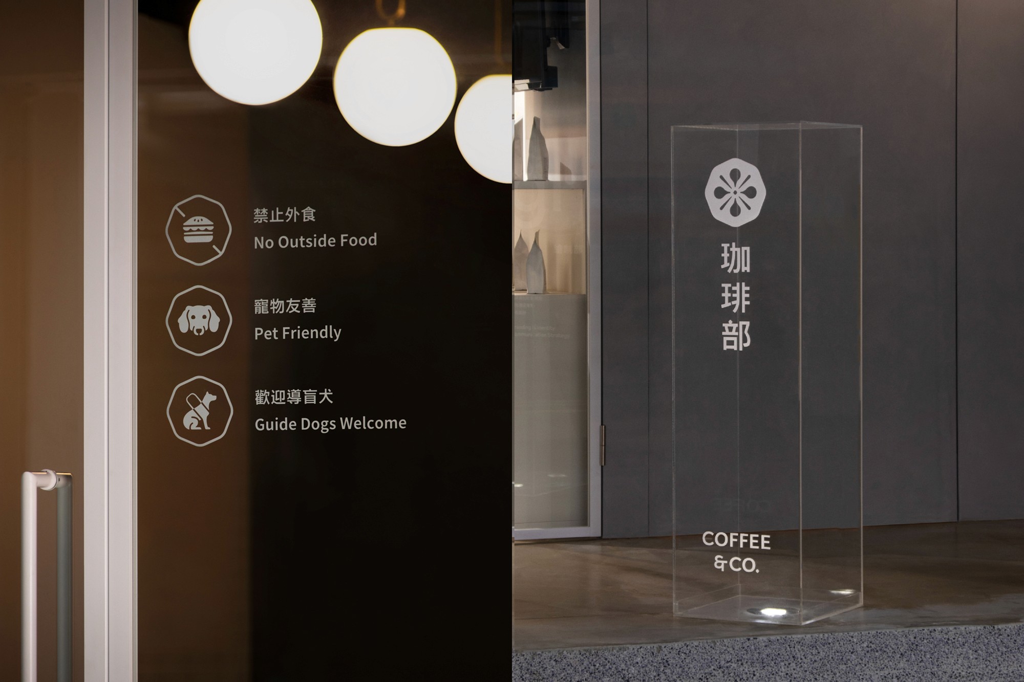
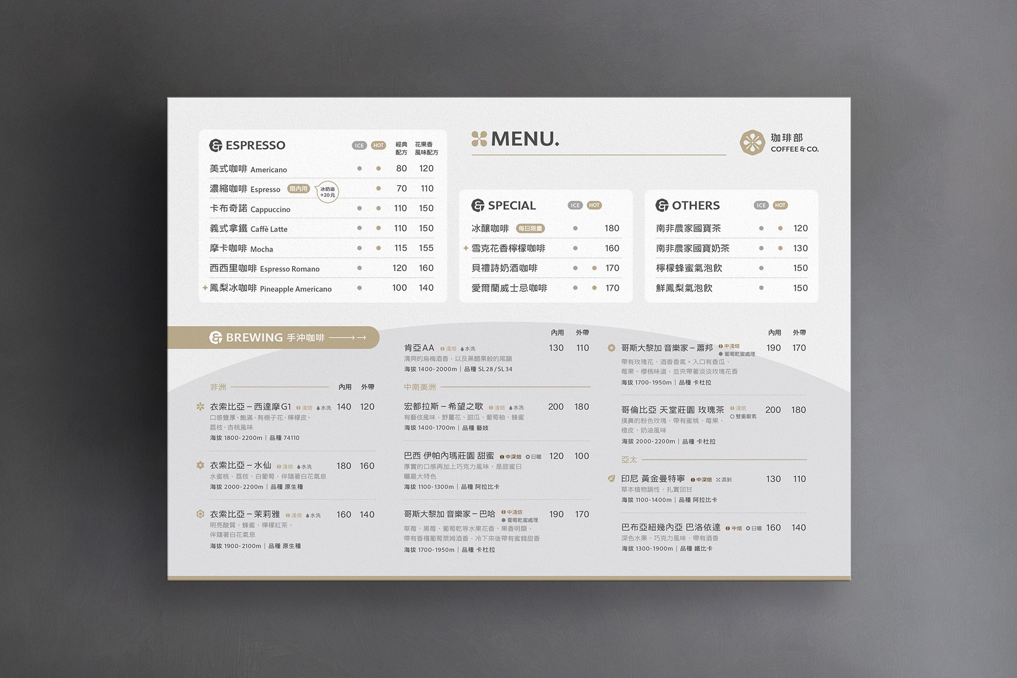
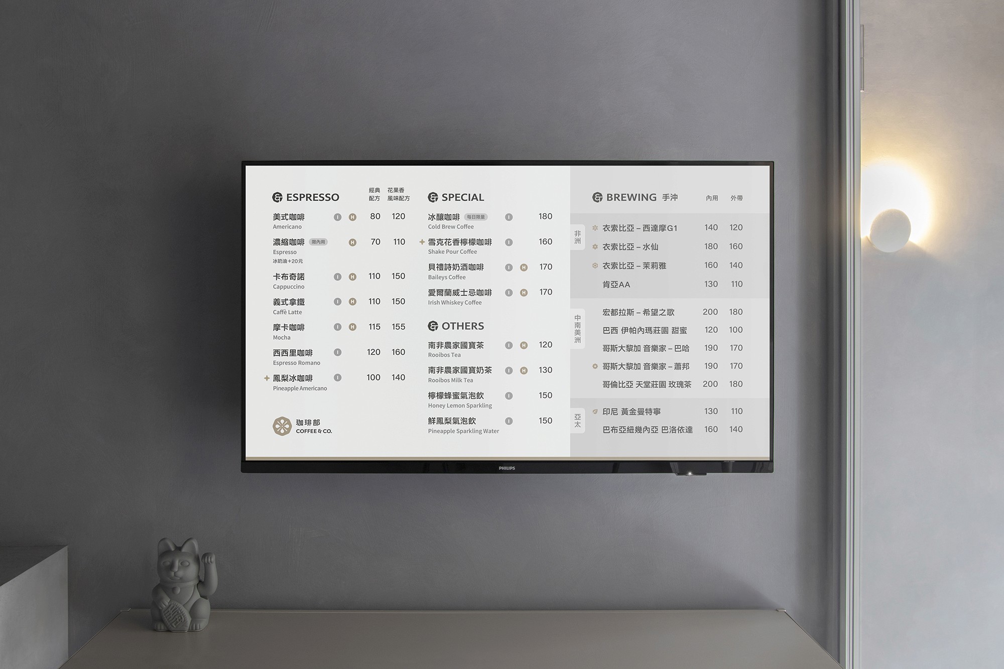
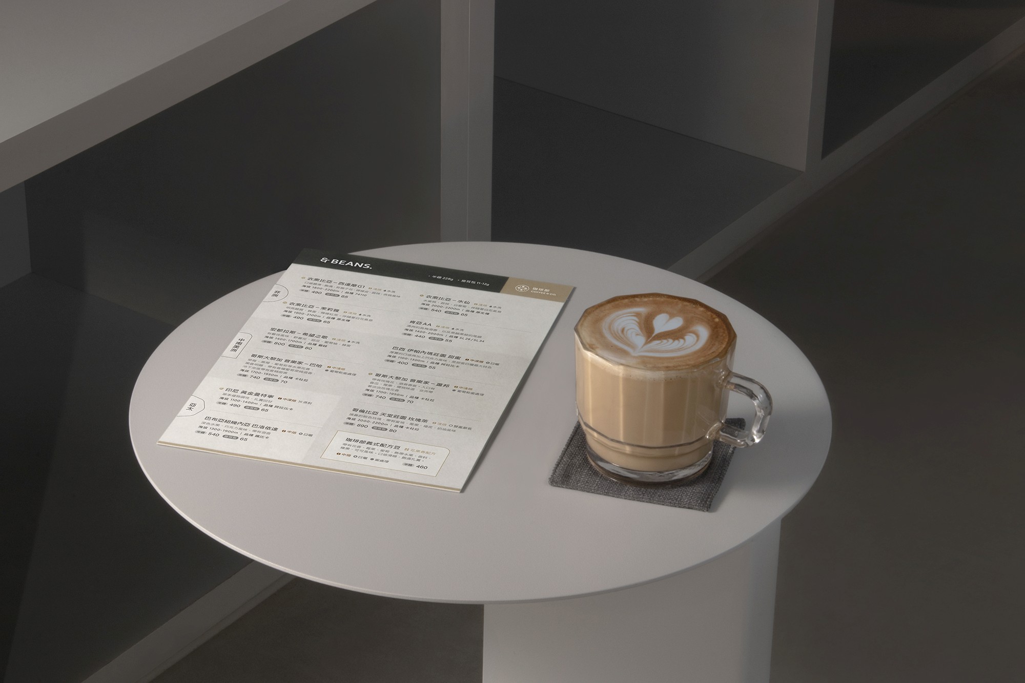
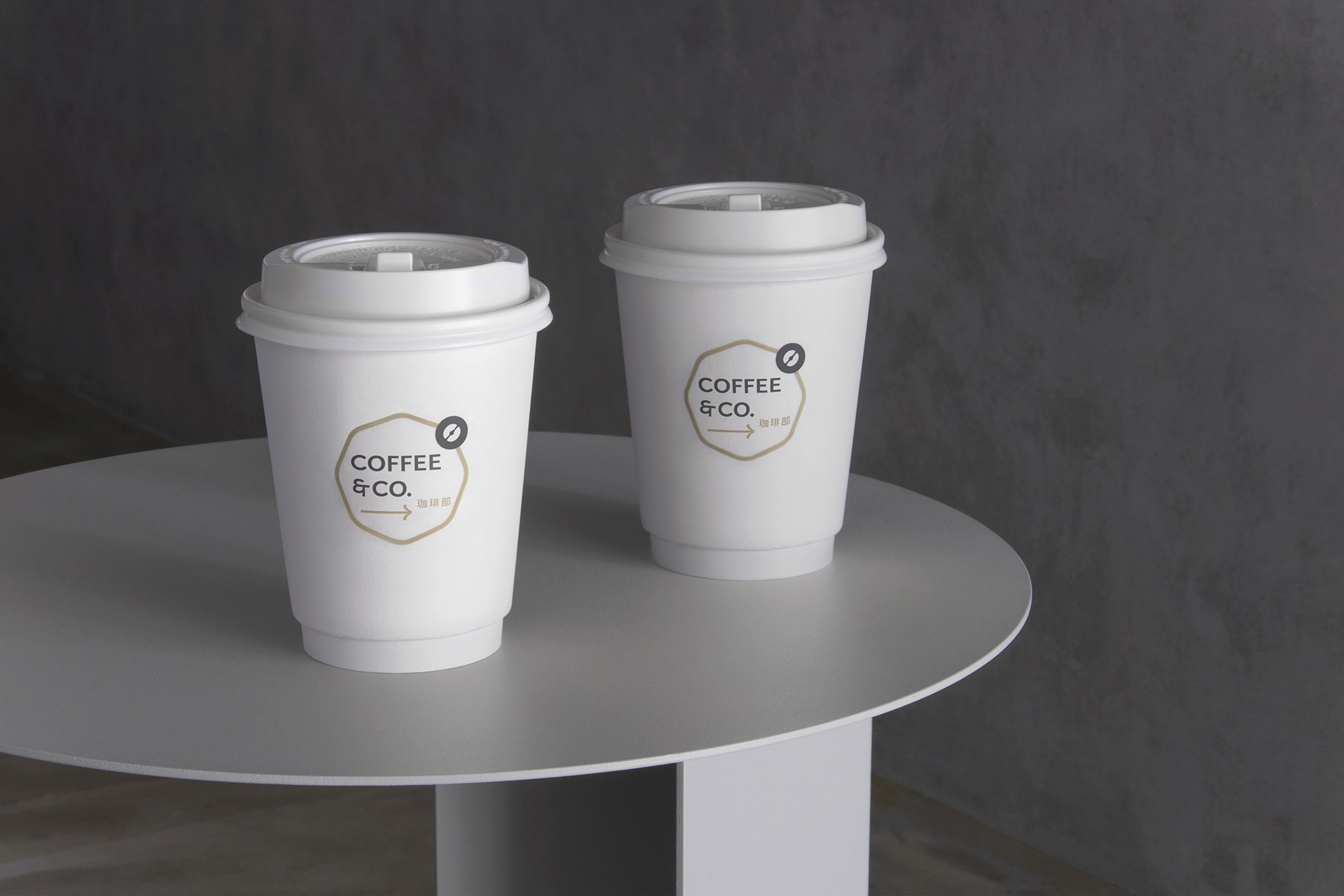
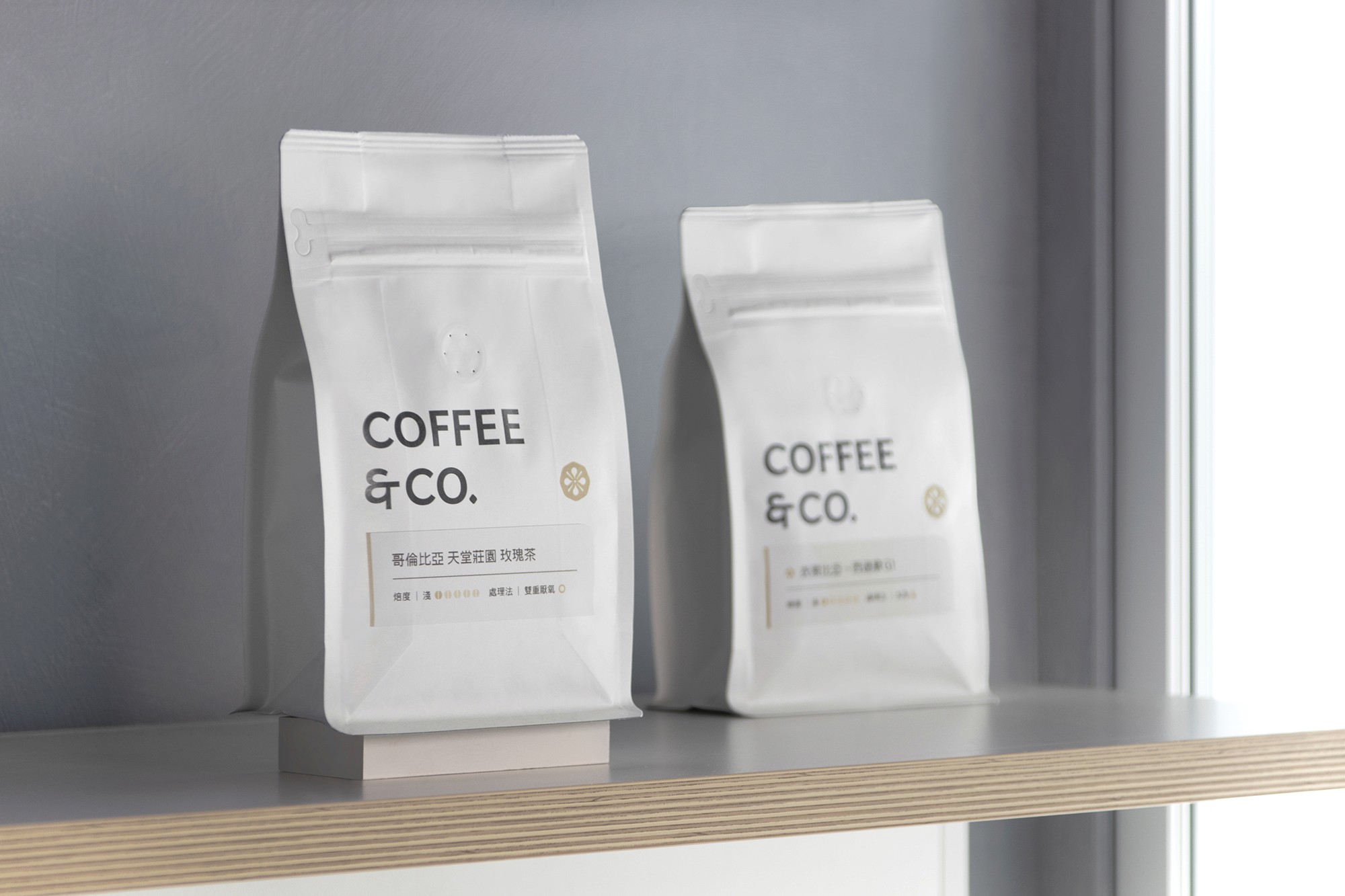
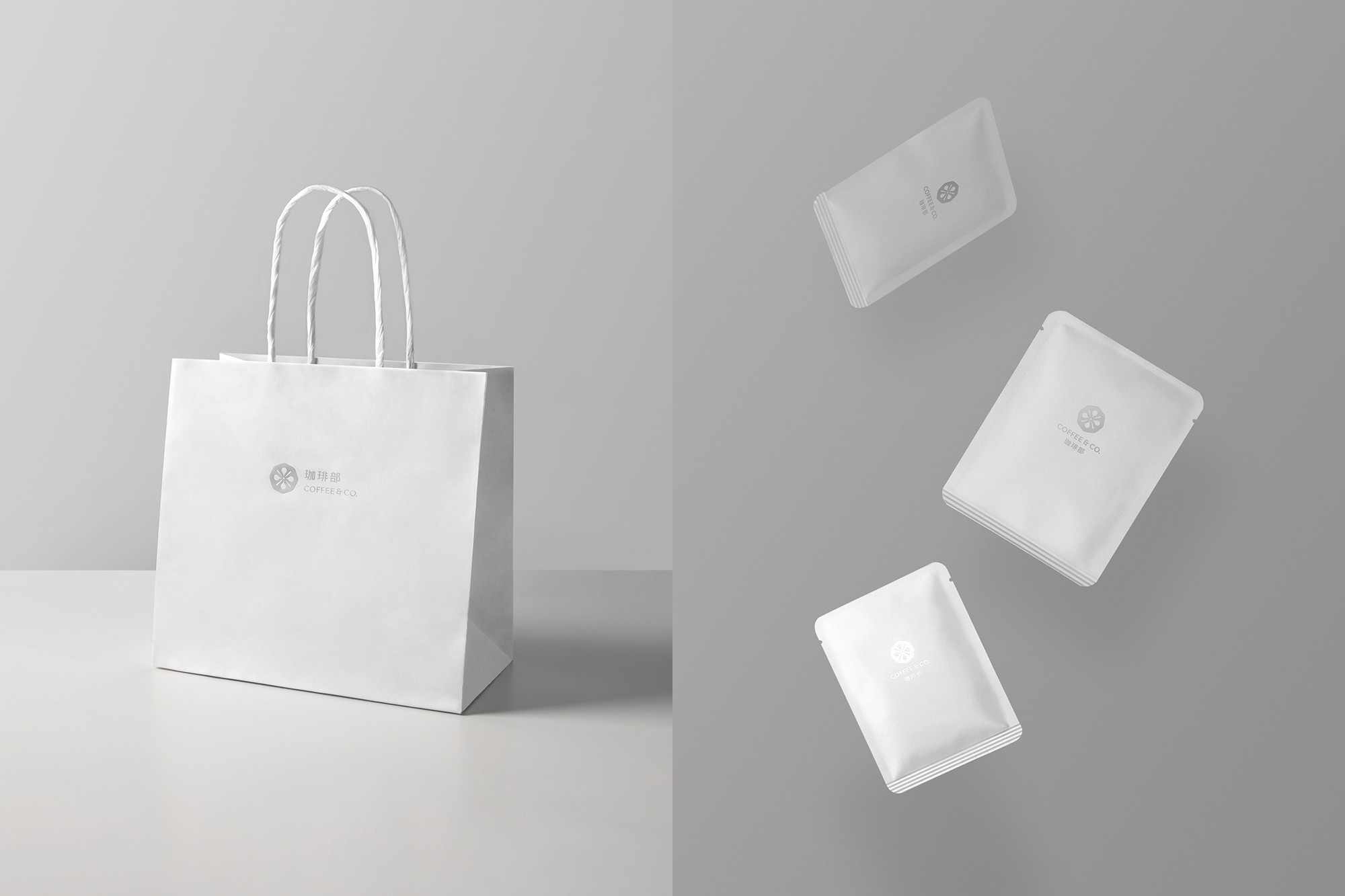
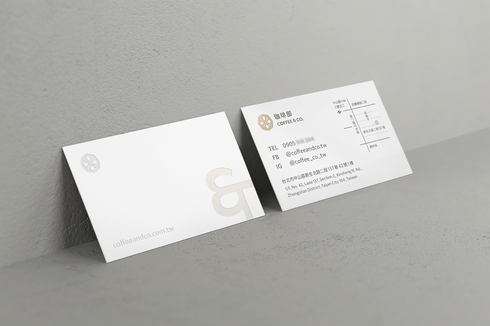
COFFEE & CO. is a complex space that combines coffee and design, located in Taipei. The café offers a wide range of pour over coffee and espresso coffee, with fruit and floral scents, and the hope that everyone can enjoy the richness of fruit and floral tastes in the most professional and intuitive way. Their baristas are SCA Barista Skills, Roasting and Brewing certified. The recipe is a blend of three kinds of beans from various regions. The most distinctive feature is the explosive floral and fruity flavor in the first part of the blend, and the unobtrusive finish of the blend.
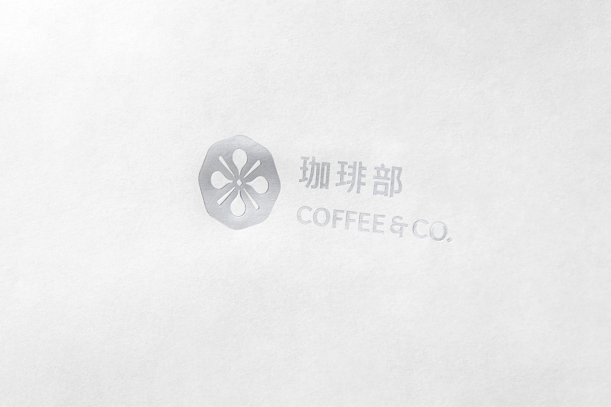
Our team was involved in the brand strategy and identity system design for COFFEE & CO., we even participated in the spatial design of the interior. Their logo was constructed by combining the essence of coffee pickle shapes, acidity and sweetness, while the space was created using a combination of dark and light gray tones and Japanese Cypress, echoing the main color palette of the brand identity and physically presenting the visual imagery of the brand.
珈琲部 COFFEE & CO.


CL
珈琲部 COFFEE & CO.
AGCY
-
CONS
-
CD
Billy Cheung
AD
-
D
Zora Huang
ILLSTR
-
PM
Abby Wang
ED
-
ID
Billy Cheung
P
-
PROD
-
PHOTOG
-