Project
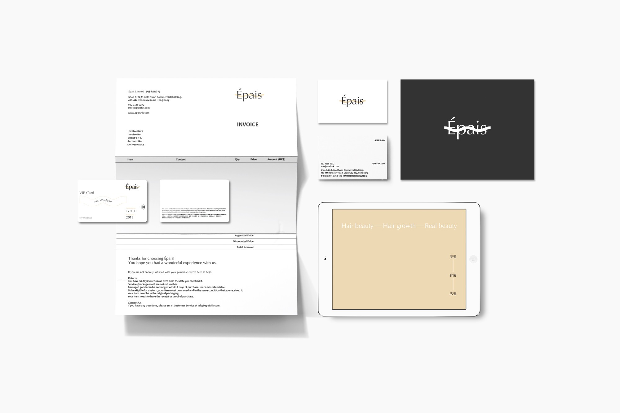
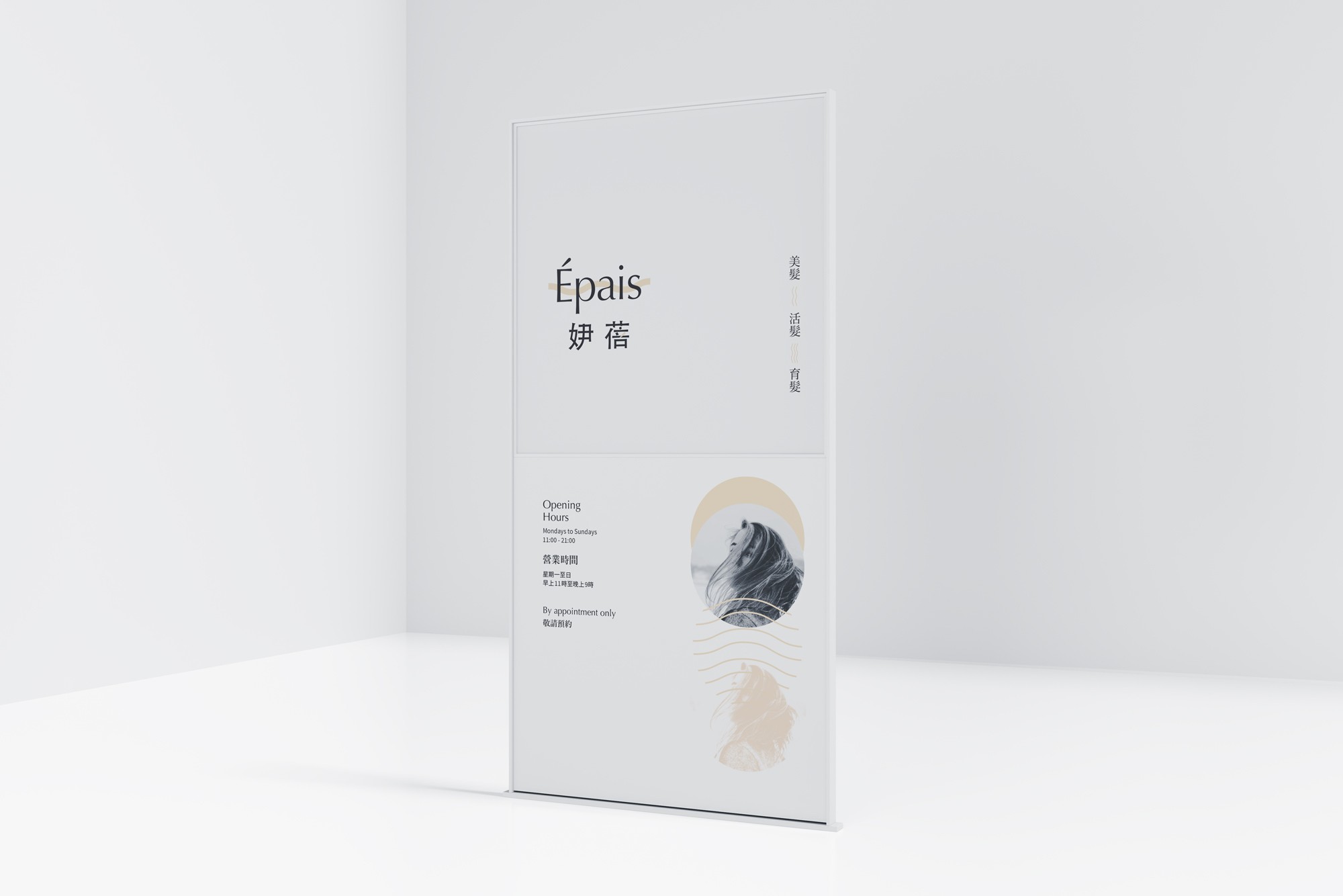
Épais
Category
Brand Identity, Brand Strategy
Year
2019
Awards
-
About
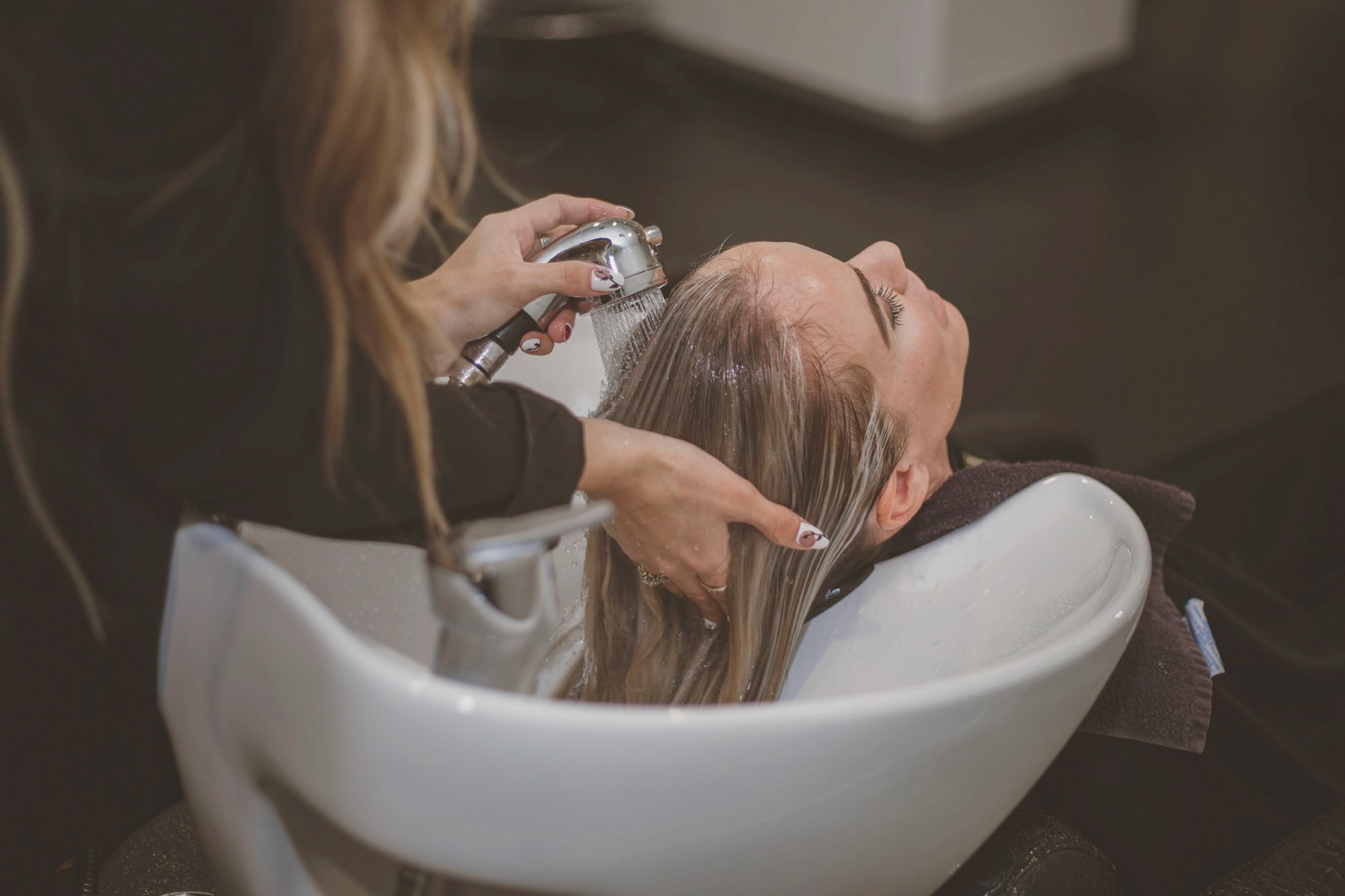
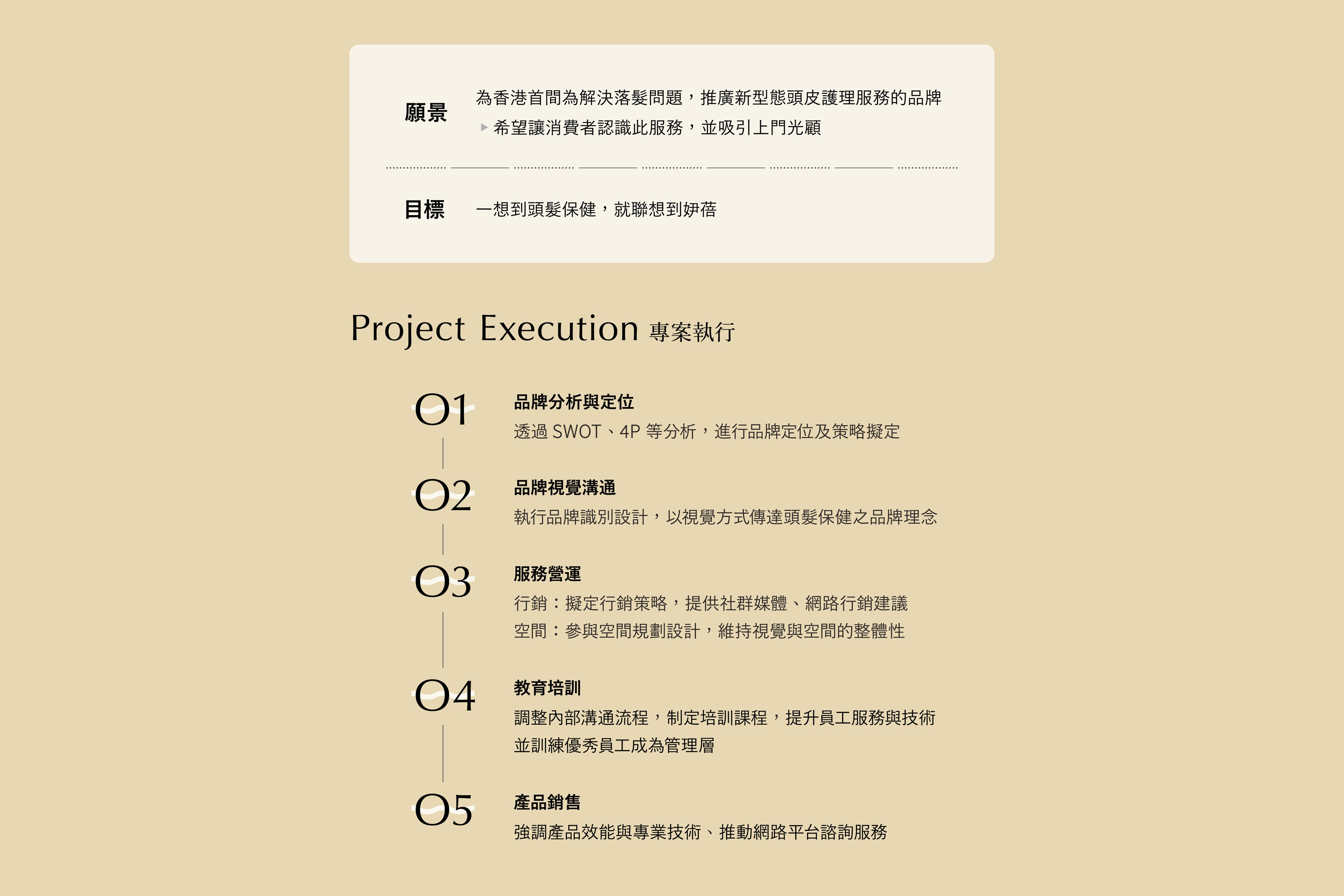
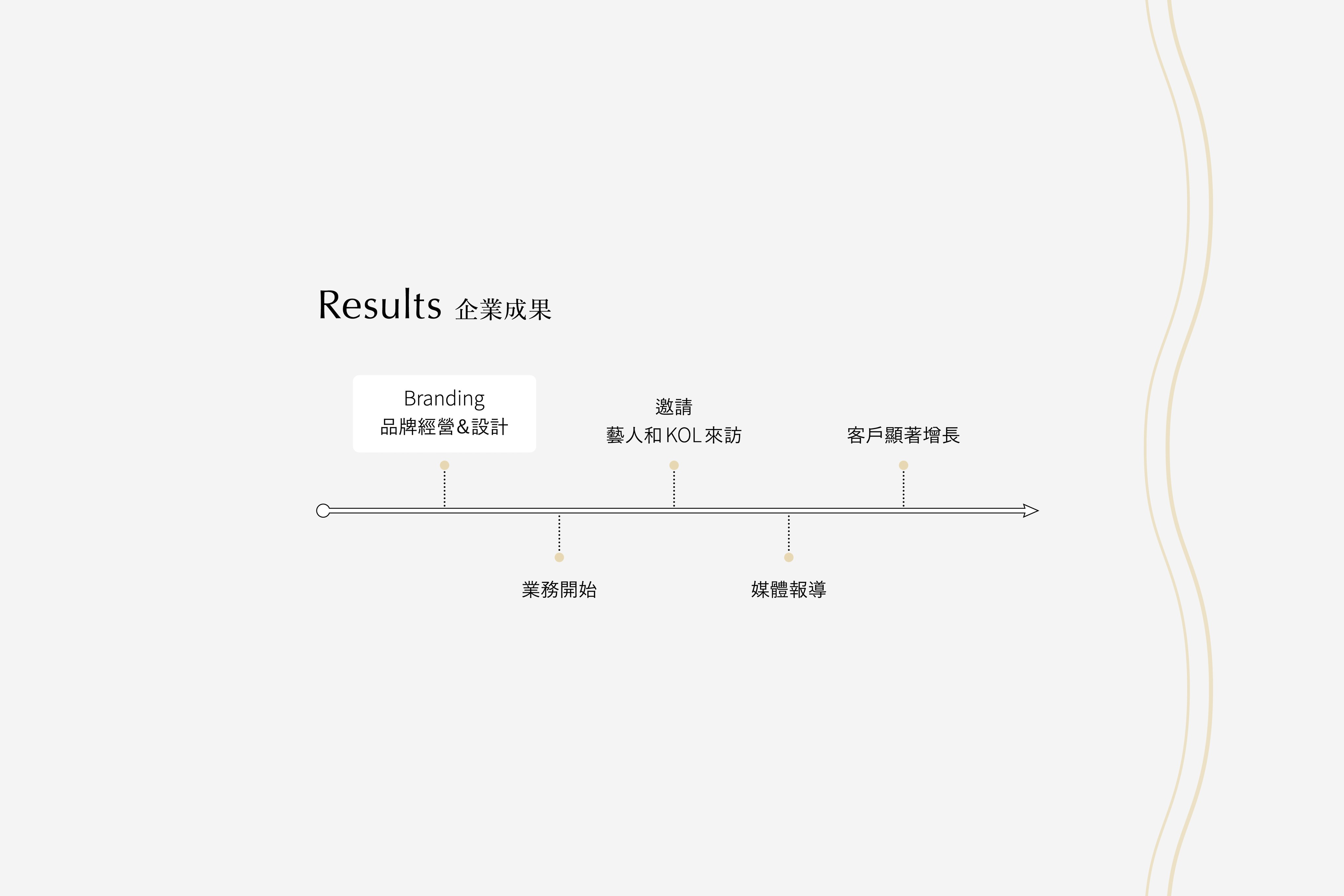
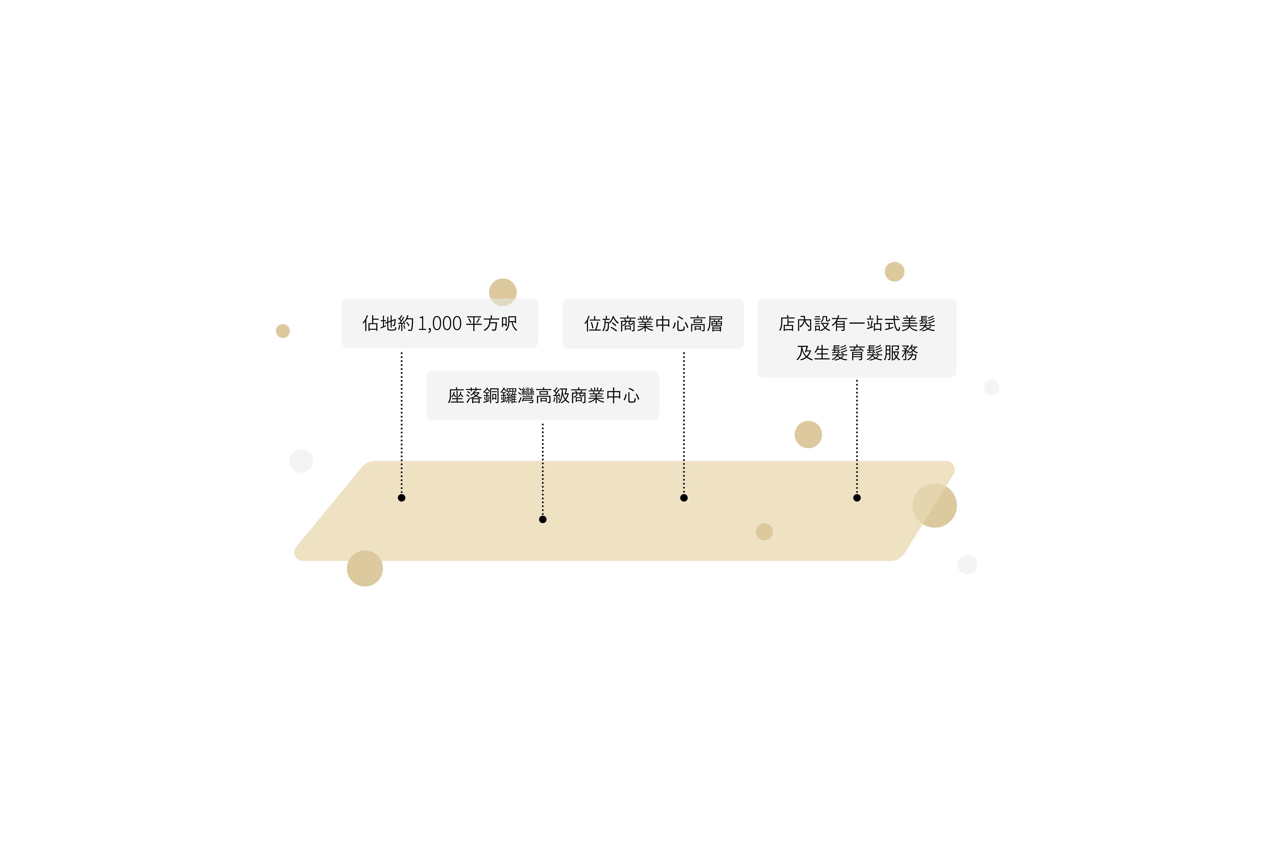
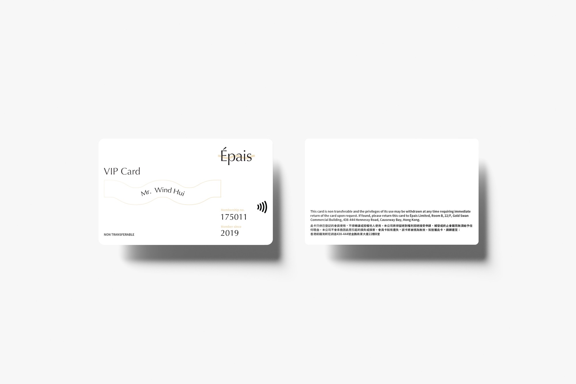
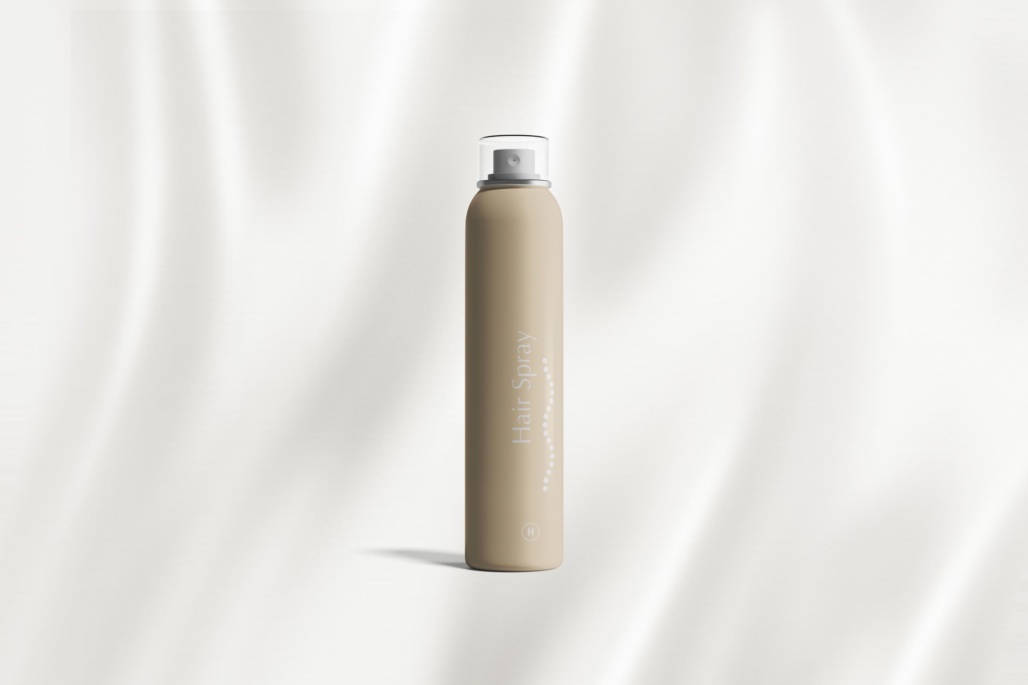
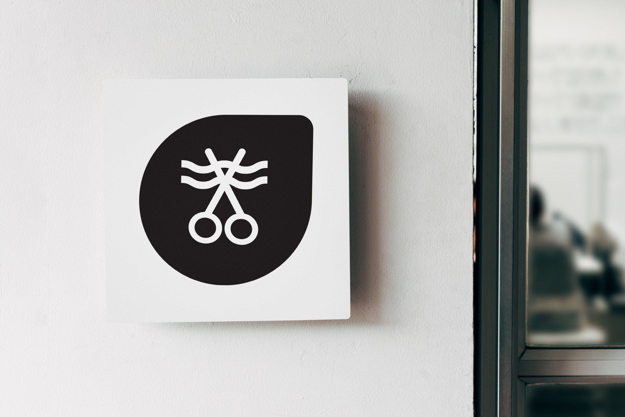
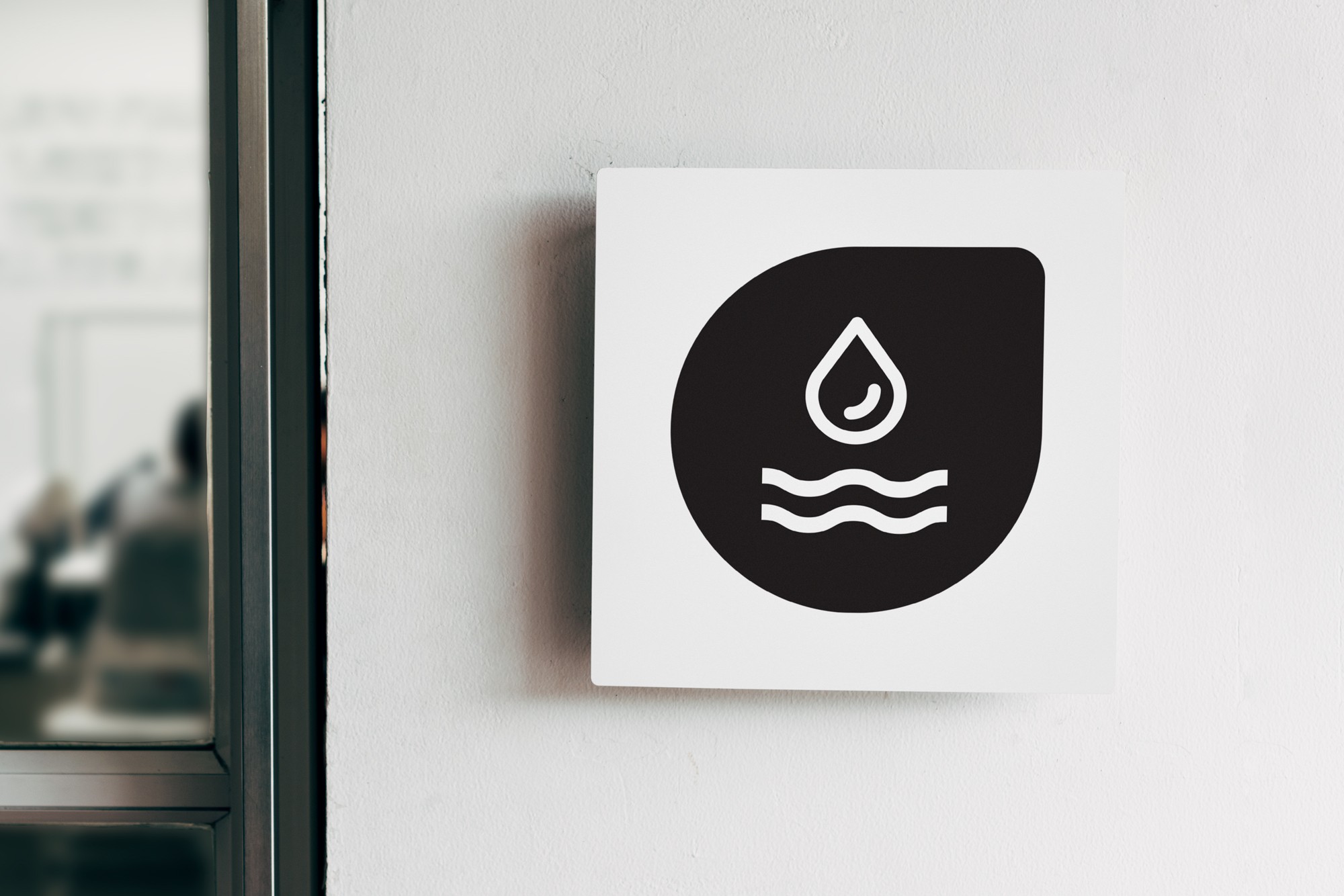
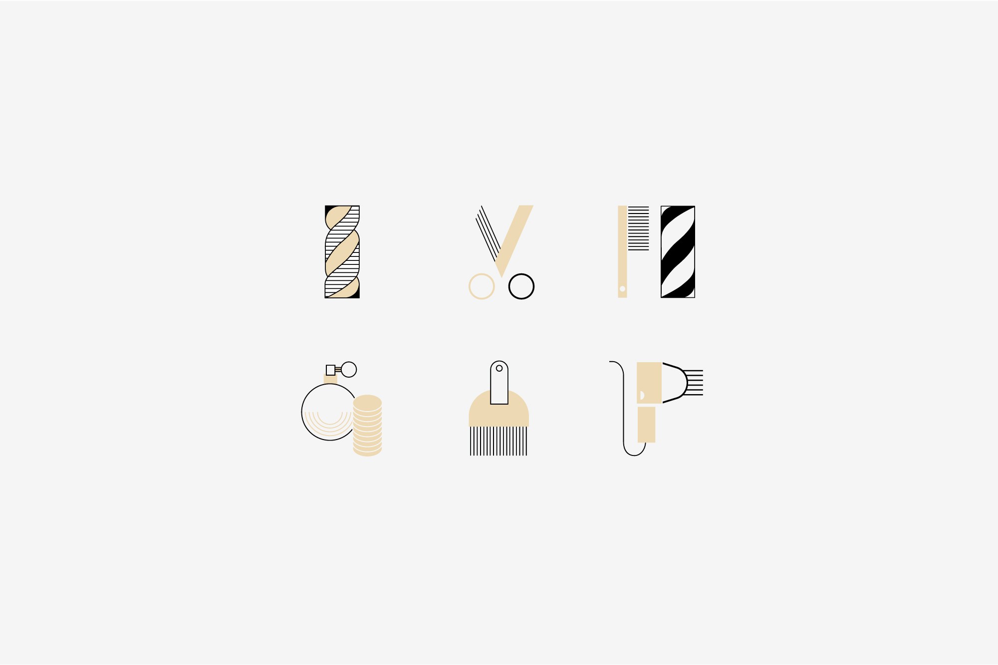
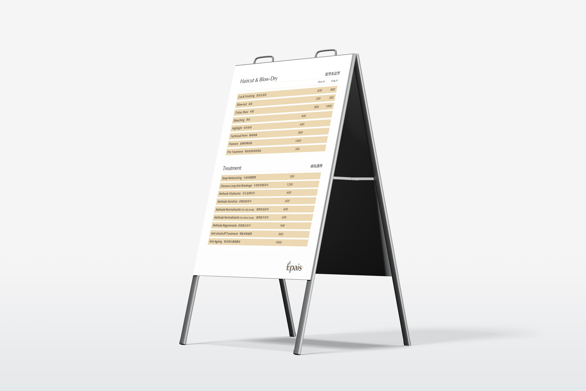
Épais is a newly found health and beauty concept, as its establishment of a hair salon combined with scalp care center. Through its detailed analysis of scalp health, decluttering from daily hair product consumptions, Épais offers deeply layered scalp care treatments with its organic product lineup. The task was to emphasize the brand's voice: introducing a new and unique market competitor.
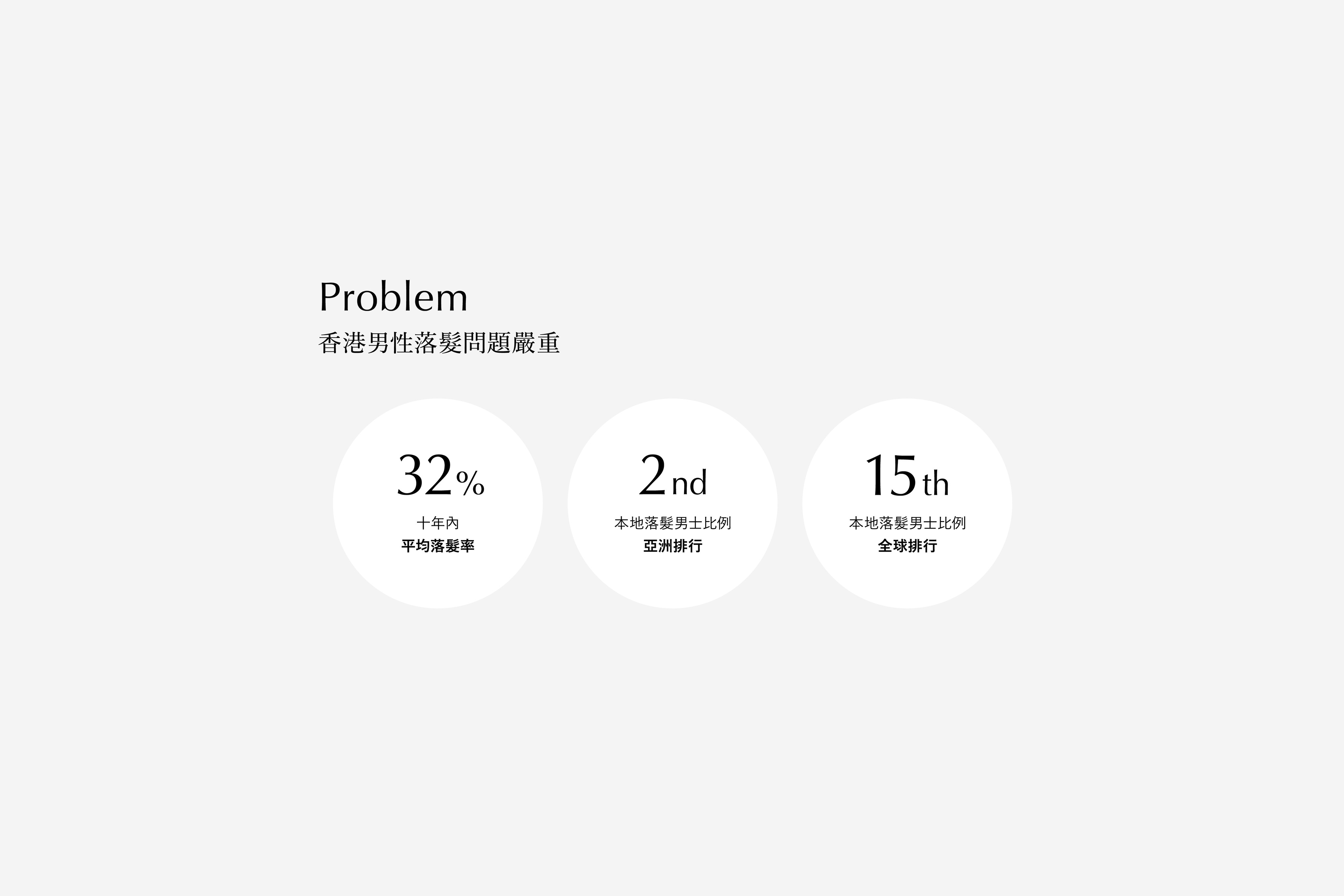
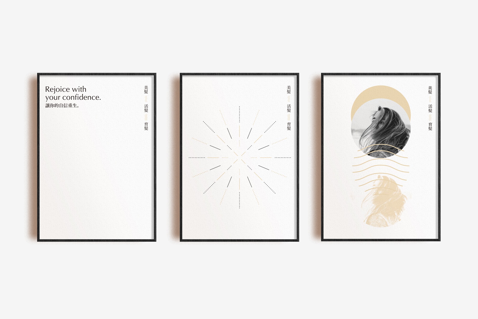
Hair loss has been a common disorder in men and women, with a reported incidence of high general population. Épais is a scalp treatment center that offers an alternative solution beyond hair transplantation, with an innovative approach focus on hair and nutrition.
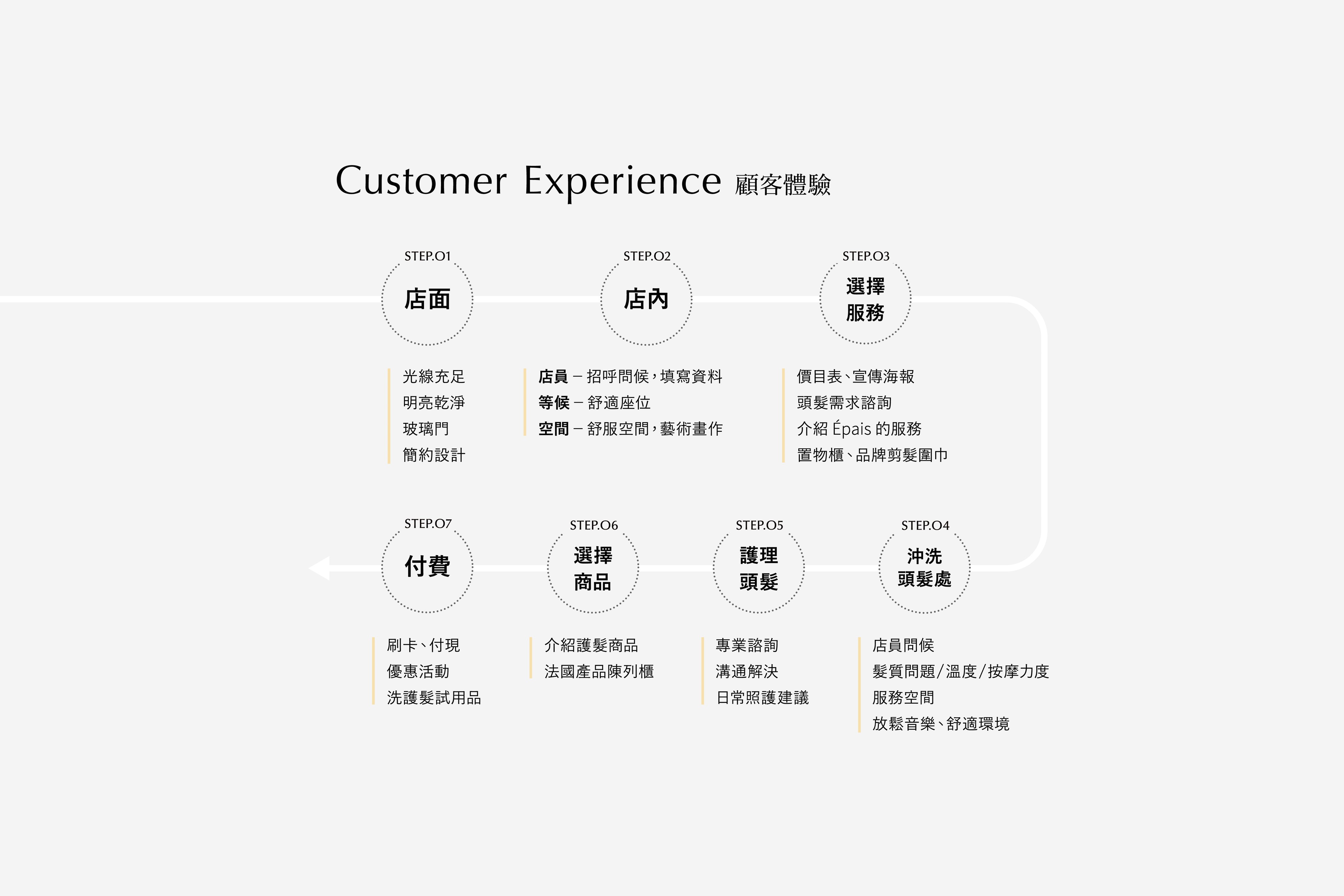
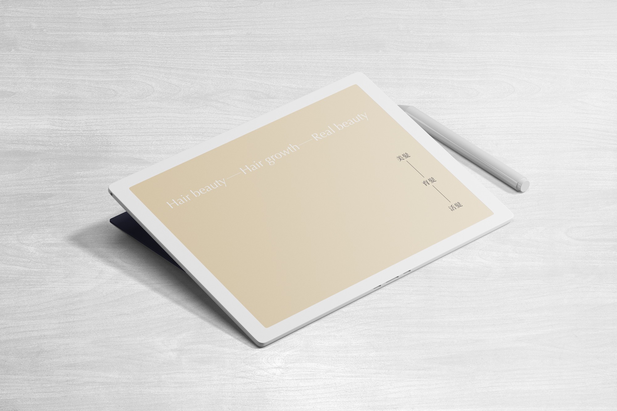
Designed with the brief of the newly approach to the market, our approach was to align with the company’s goal of providing an aesthetic environment, for connection with customers. In response to their tagline of "Hair beauty—Hair growth—Real beauty", gaining healthy scalp begins from styling, with building a health body, results in true beauty. The identity system was formed by minimal visual elements, to project the brand's voice.
Épais


CL
Épais
AGCY
Daedalustudio
CONS
-
CD
Billy Cheung
AD
-
D
Alice Tsang, Billy Cheung
ILLSTR
-
PM
Wind Hui
ED
Augustine Huang
ID
-
P
L Force Printing
PROD
-
PHOTOG
-