Project
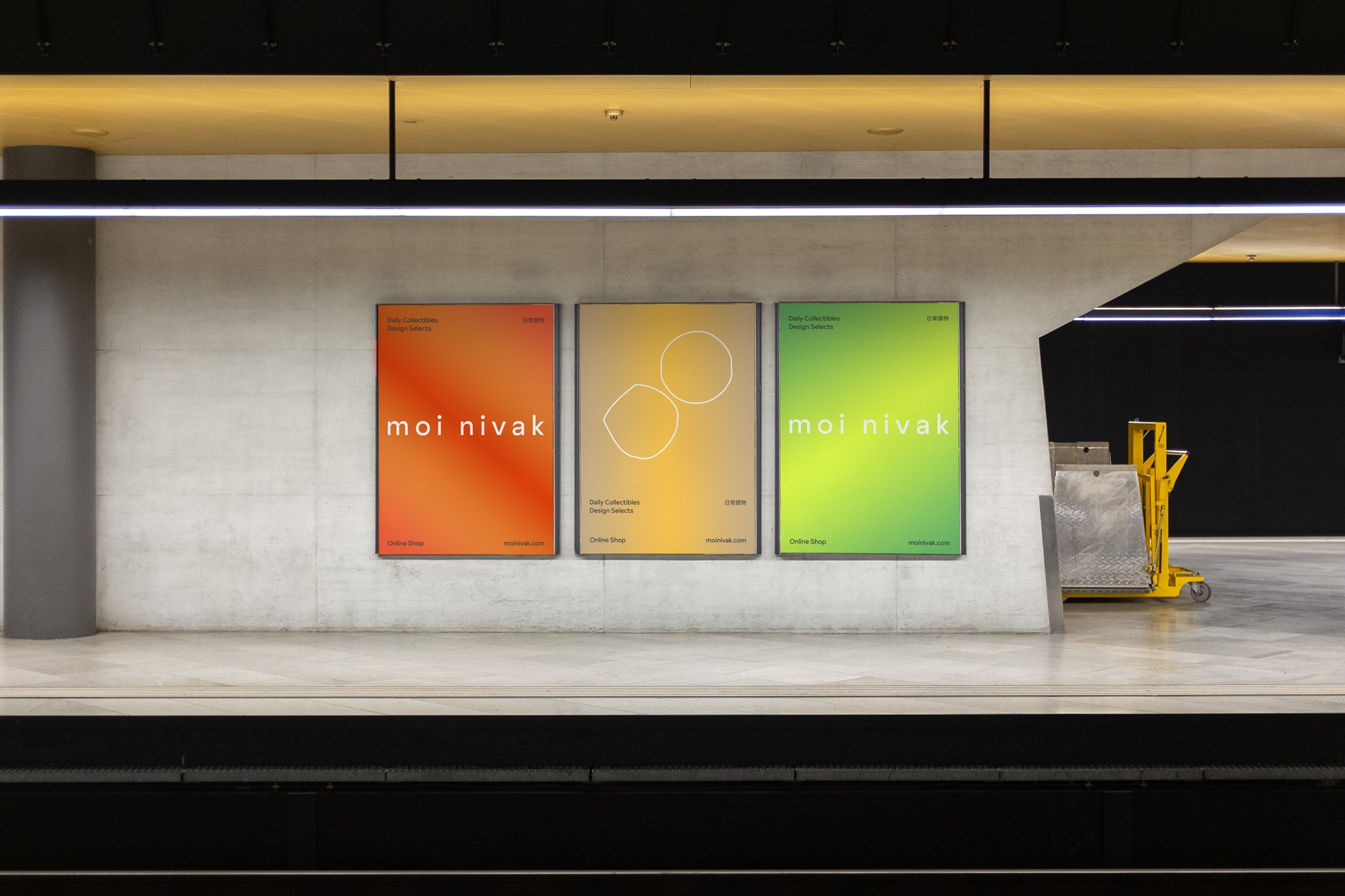
moi nivak
Category
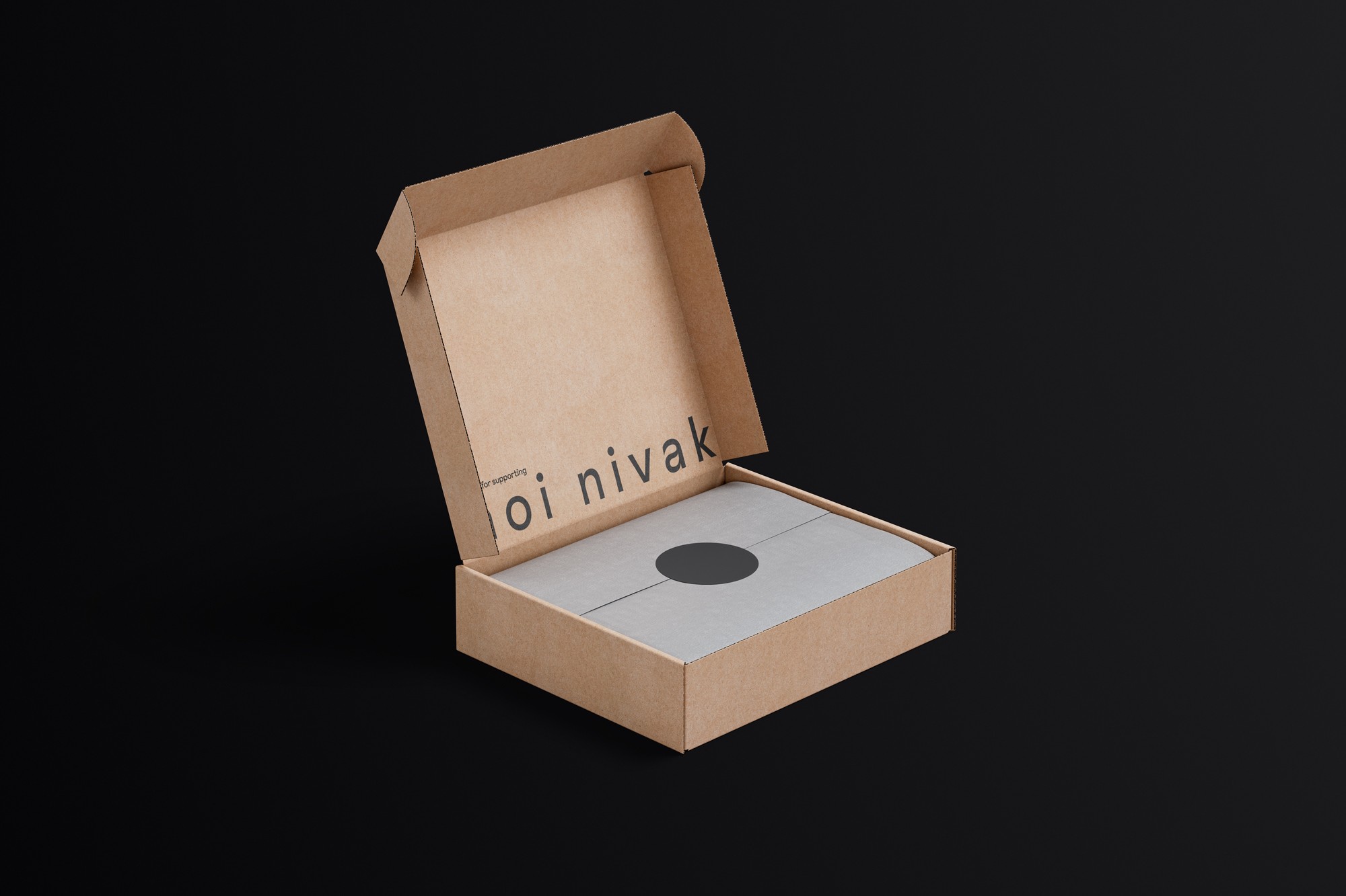
Brand Identity, Packaging
Year
2020
Awards
A' Design Award, MUSE Design Awards, C-IDEA Design Award
About
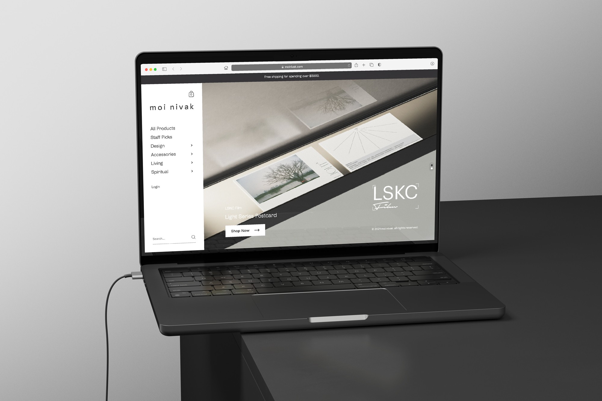
moi nivak is an online retailer dedicated to curation of contemporary collectibles, carefully select daily collectibles and design items from around the world. Combining a select store and design shop, the select store opens its door to welcome arts and cultural collectible lovers from around the world.
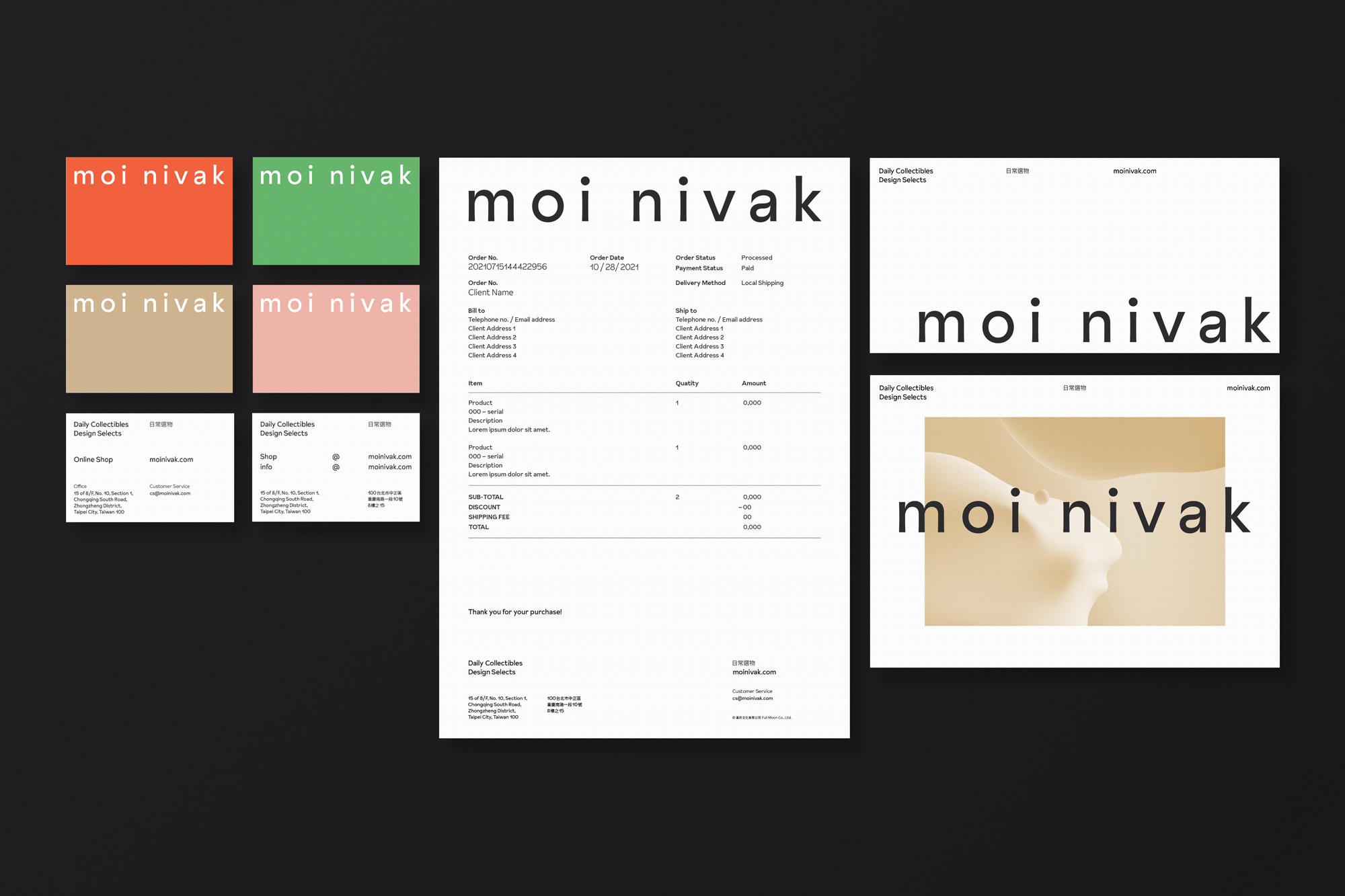
Graphic Dpt has developed the brand identity framework to introduce moi nivak as a new player in the field. The brand system comprehends brand strategy, name, stationery and website.
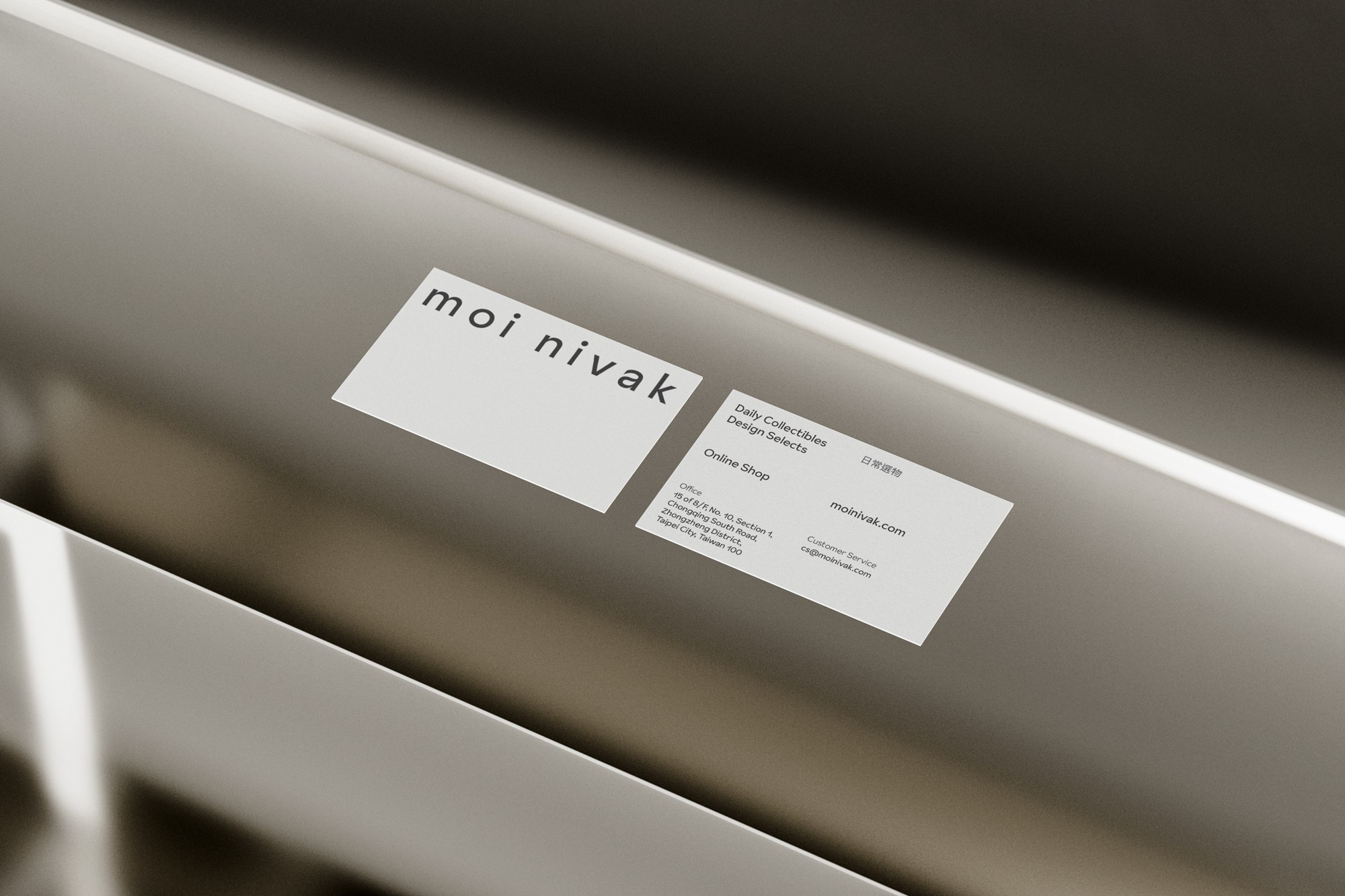
The foundation of the moi nivak brand is set off by primary typography set in Sunset Gothic. The word mark is a bespoke typeface, developed by Colophon Foundry's Benjamin Critton, with subjective mélange of a multitude of unattributed sans-serif painting styles. The typographic approach has been used throughout to provide legibility across all of moi nivak's brand communications.
We went into research for typefaces at first. Sunset Gothic is a dexterous, workhorse sans-serif, designed by Benjamin Critton, published by Colophon Foundry. The brand's typography has signature gesture and legibility, include curvature terminals and type’s horizontal strokes, implicates the diversity of the business — a select store with collectible groceries and design products.
moi nivak


CL
Full Moon 滿月文化
AGCY
-
CONS
-
CD
Billy Cheung
AD
-
D
Billy Cheung
ILLSTR
-
PM
-
ED
-
ID
-
P
-
PROD
-
PHOTOG
-