Project
田匠物產 Tian Jiang Crops
Category
Brand Strategy, Brand Identity, Packaging, Digtial Design
Year
2022
Awards
-
About
All the natural freshness from the field!
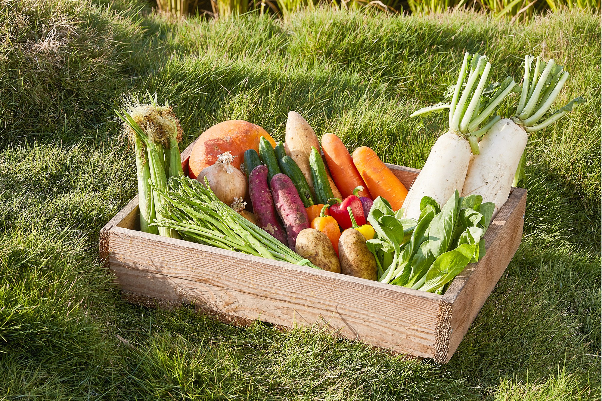
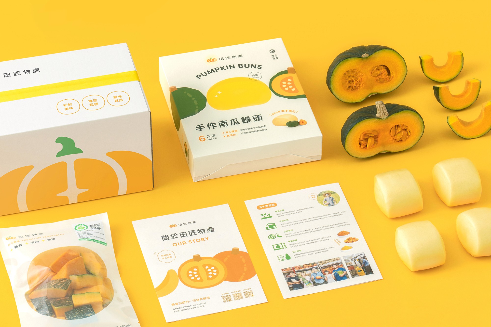
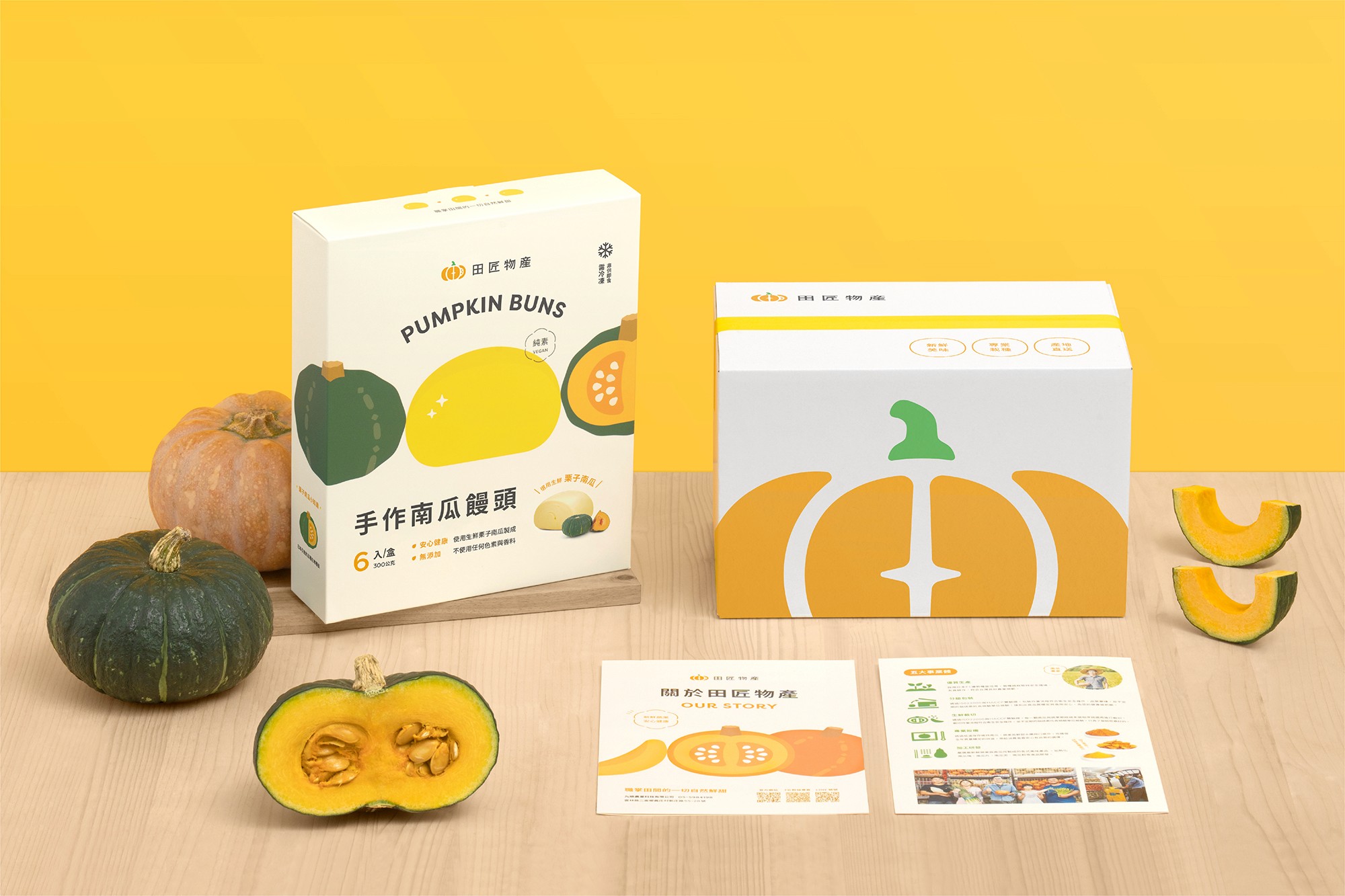
Tian Jiang Crops is a fresh production brand of Wan Shun Agriculture, which means artisans from the fields. In order to produce safe and delicious agricultural products, we rely on the hard work of farmers and the bounty of the earth, as well as professional farming techniques. Tian Jiang specializes in harvesting varieties of pumpkins, such as chestnut pumpkins, and a series of processed pumpkin products. From pumpkin seeds to production and packaging, a participatory and integrated marketing model was taken in place, with friendly cultivation, fresh harvesting and processing, all of which are strictly utilized step by step, so that the sweet and delicious pumpkins can be delivered to consumers' table from the farms in Yunlin.
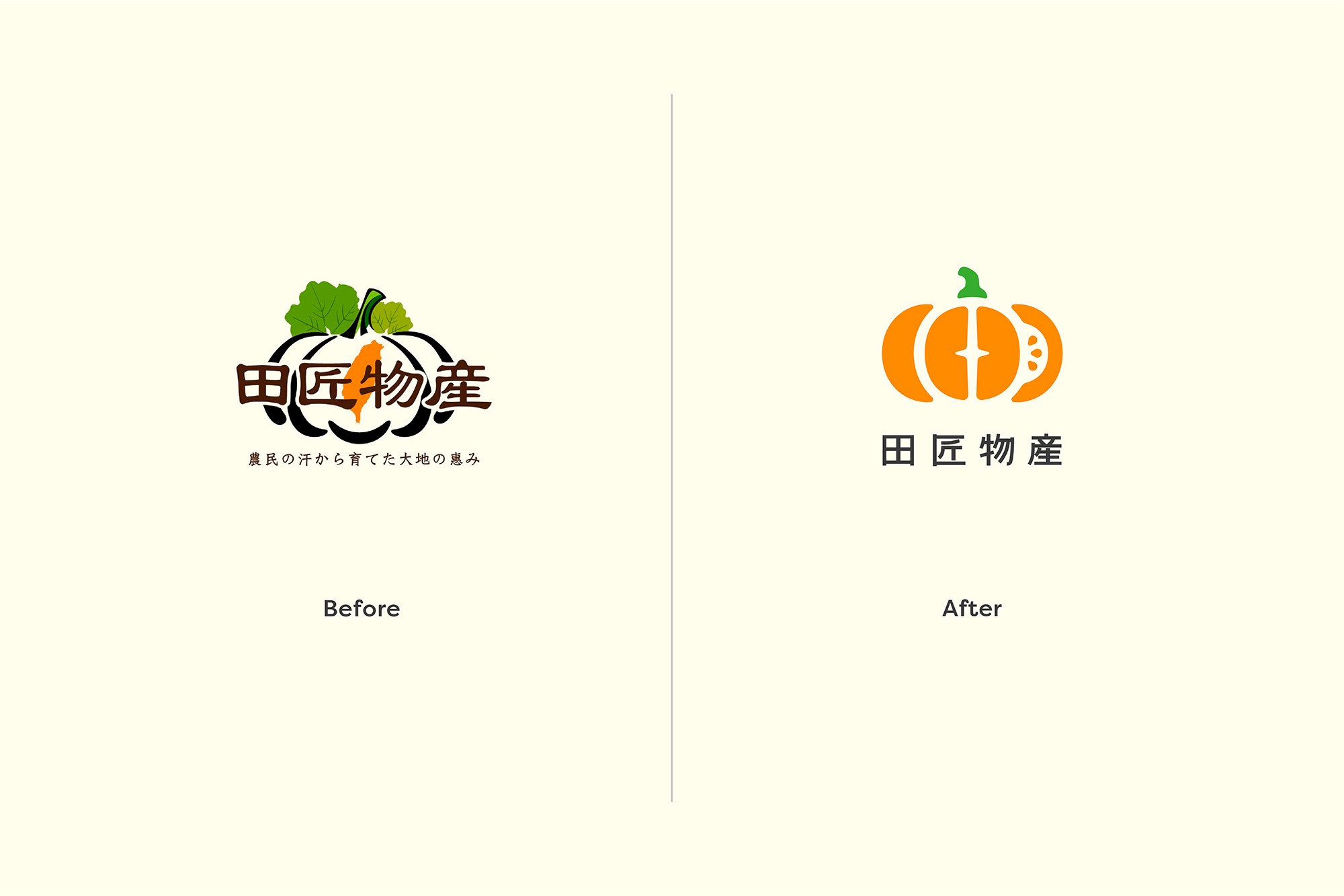
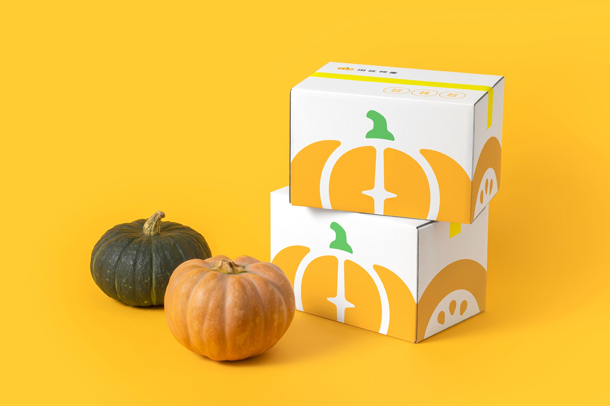
We have rebranded the original Tian Jiang products with a younger image, emphasizing the pumpkin as the core of their expertise, to grow organic fruits and vegetables. We used rounded lines and bright, warm colors to create a friendly image and bring the parent-child community closer together.
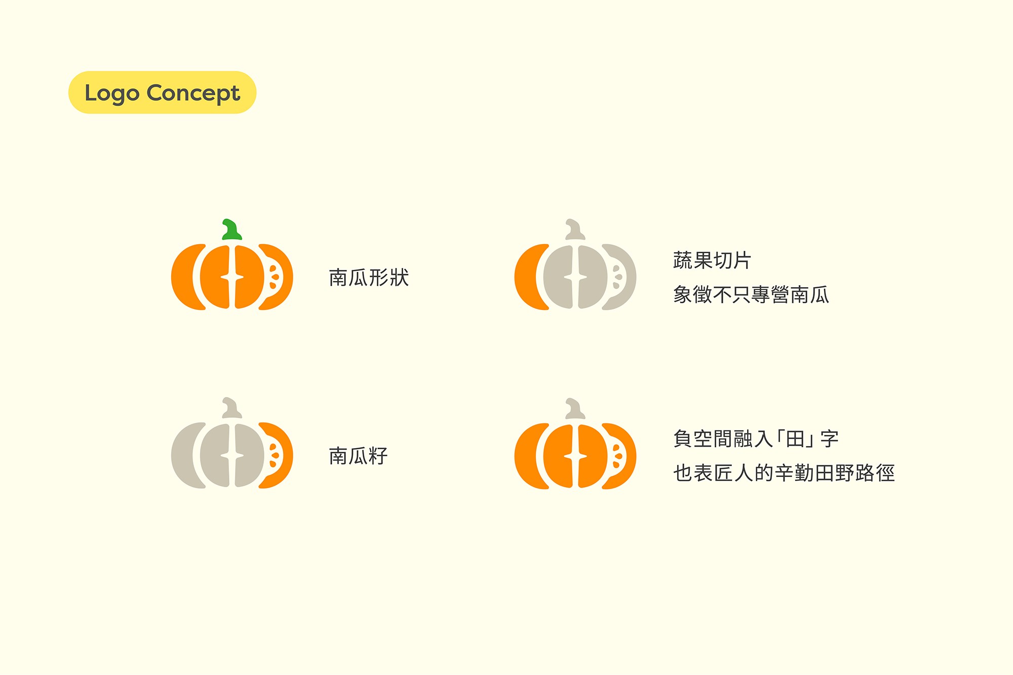
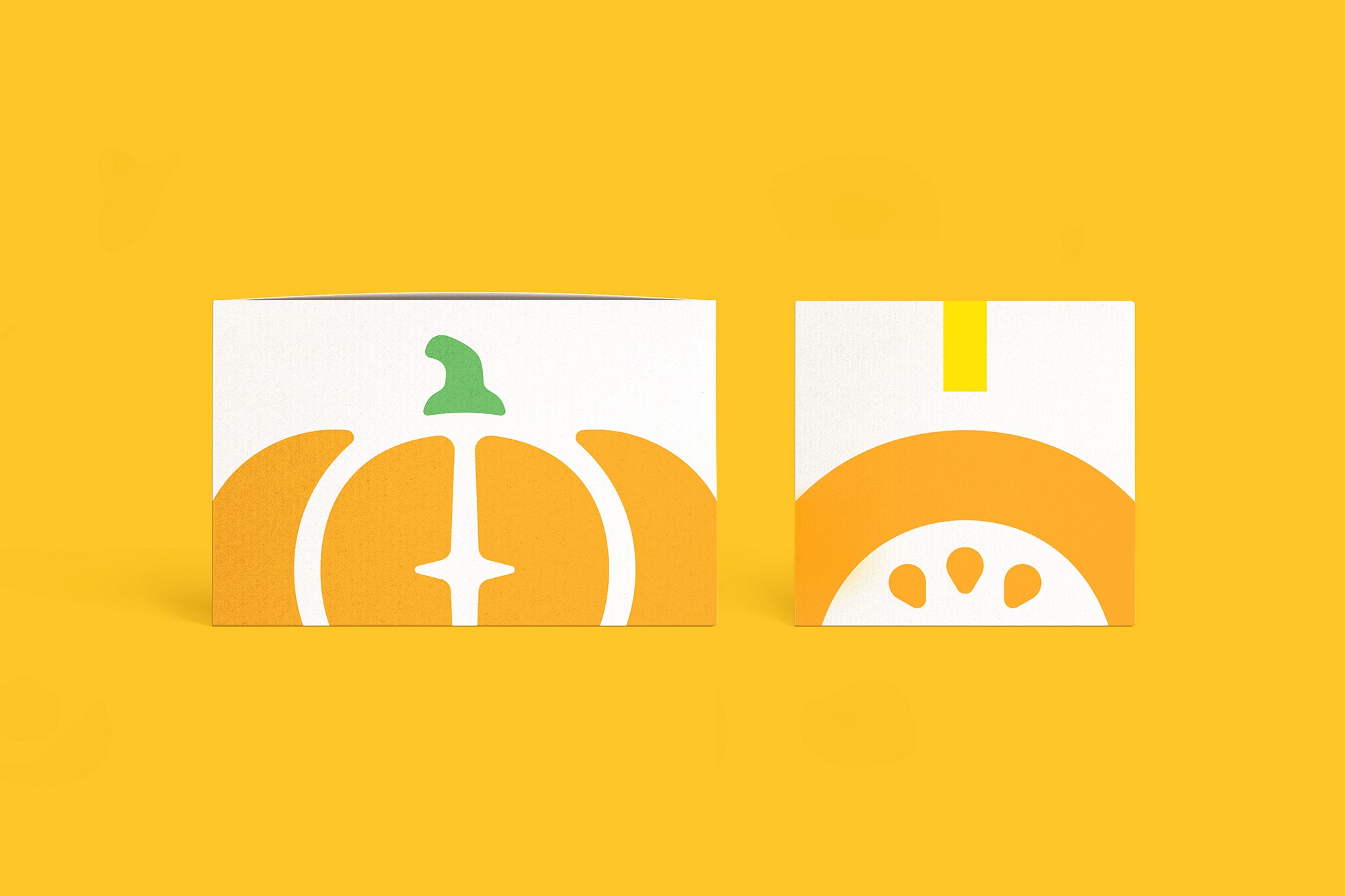
In accordance with the brand strategy, we outlined the strategic design direction of "Simplification, Transmission of Essence and Friendliness". We simplified the lines of the logo, abandoning the original complex combination of forms, so that the logo can be used at any size to clearly show the details. To convey the essence of Tian Jiang Crops as a pumpkin expert, we used pumpkin as the main logo composition, so that viewers can understand it at a glance. The logo was composed of sliced fruits and vegetables and pumpkin seeds. Not only pumpkins, but also other quality crops from the fields.
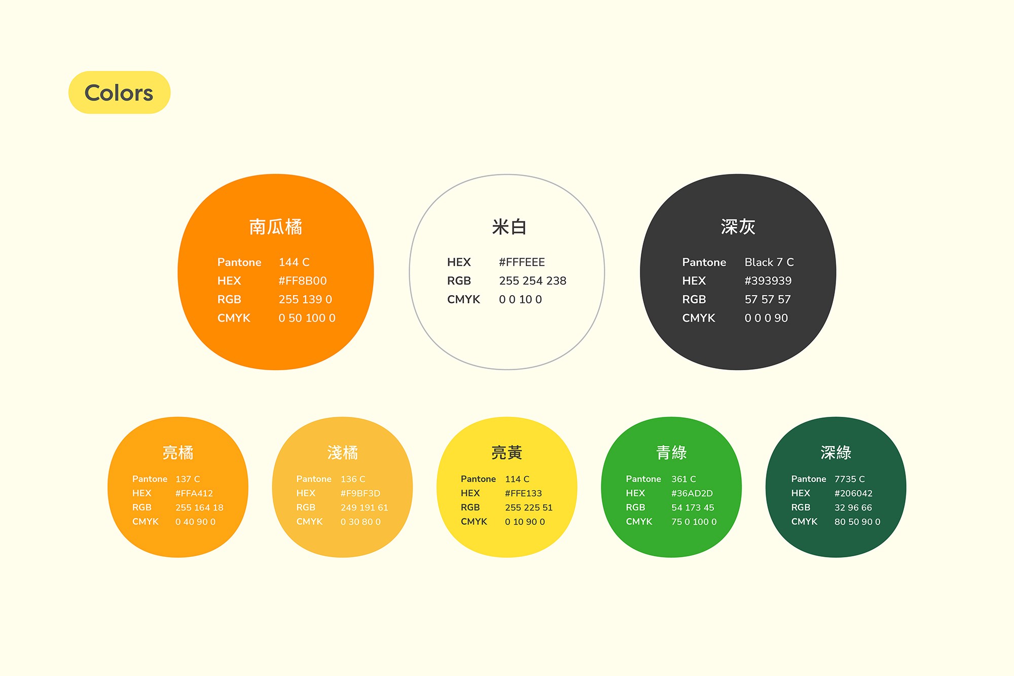
To bring the logo closer to the two target audiences of young women and housewives, we used a lot of rounded lines and rounded corners, and warm, bright, fresh colors, in the logo, to express the friendly and approachable brand tone to consumers.
The combination of the directions not only increases consumers' perception of the brand, but also differentiates it from other brands on the shelves, thus creating a deeply rooted brand image.
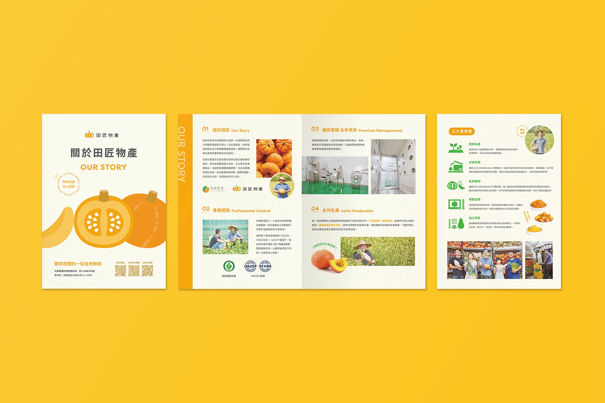
職掌田間的一切自然鮮甜!
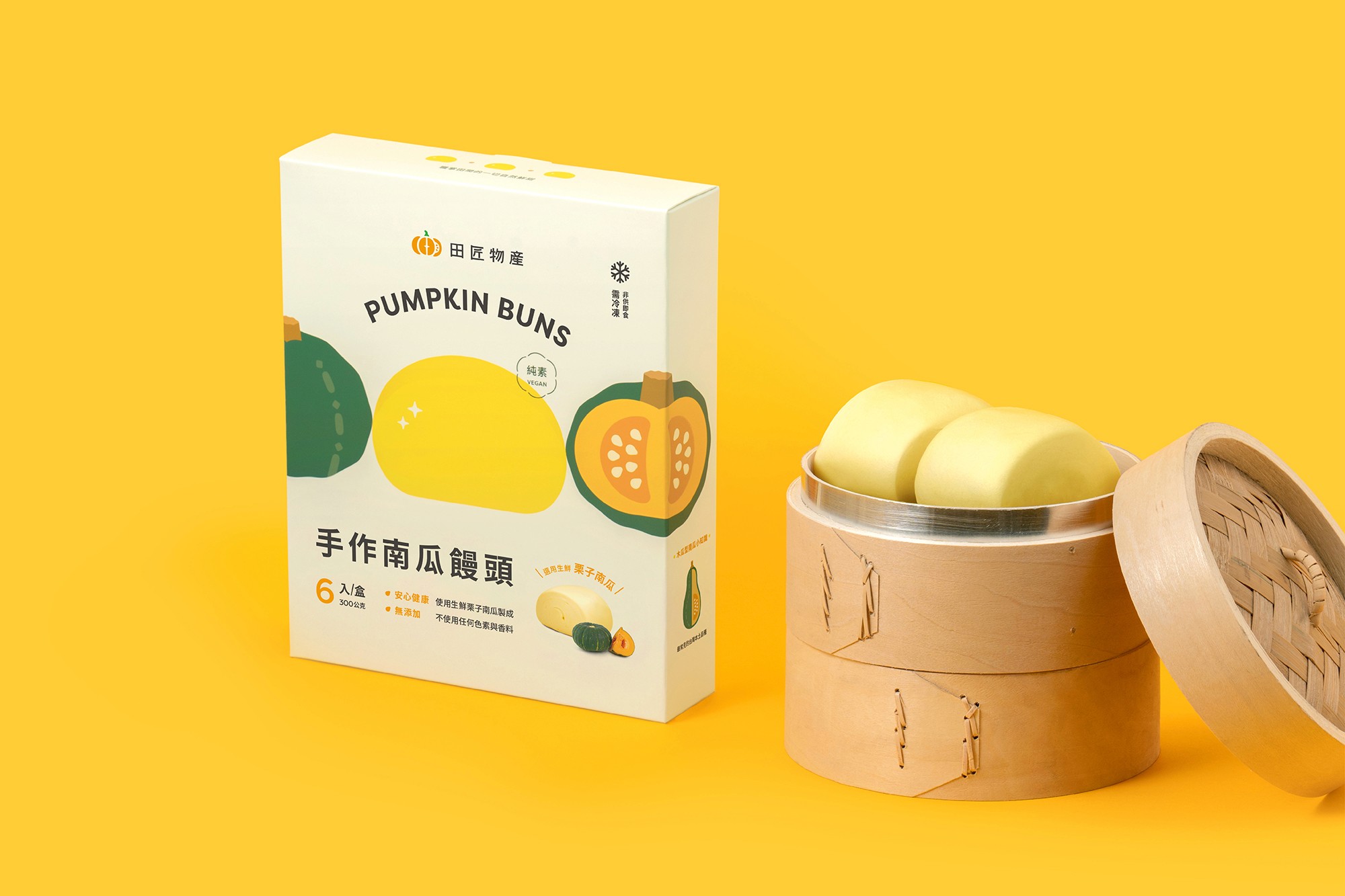
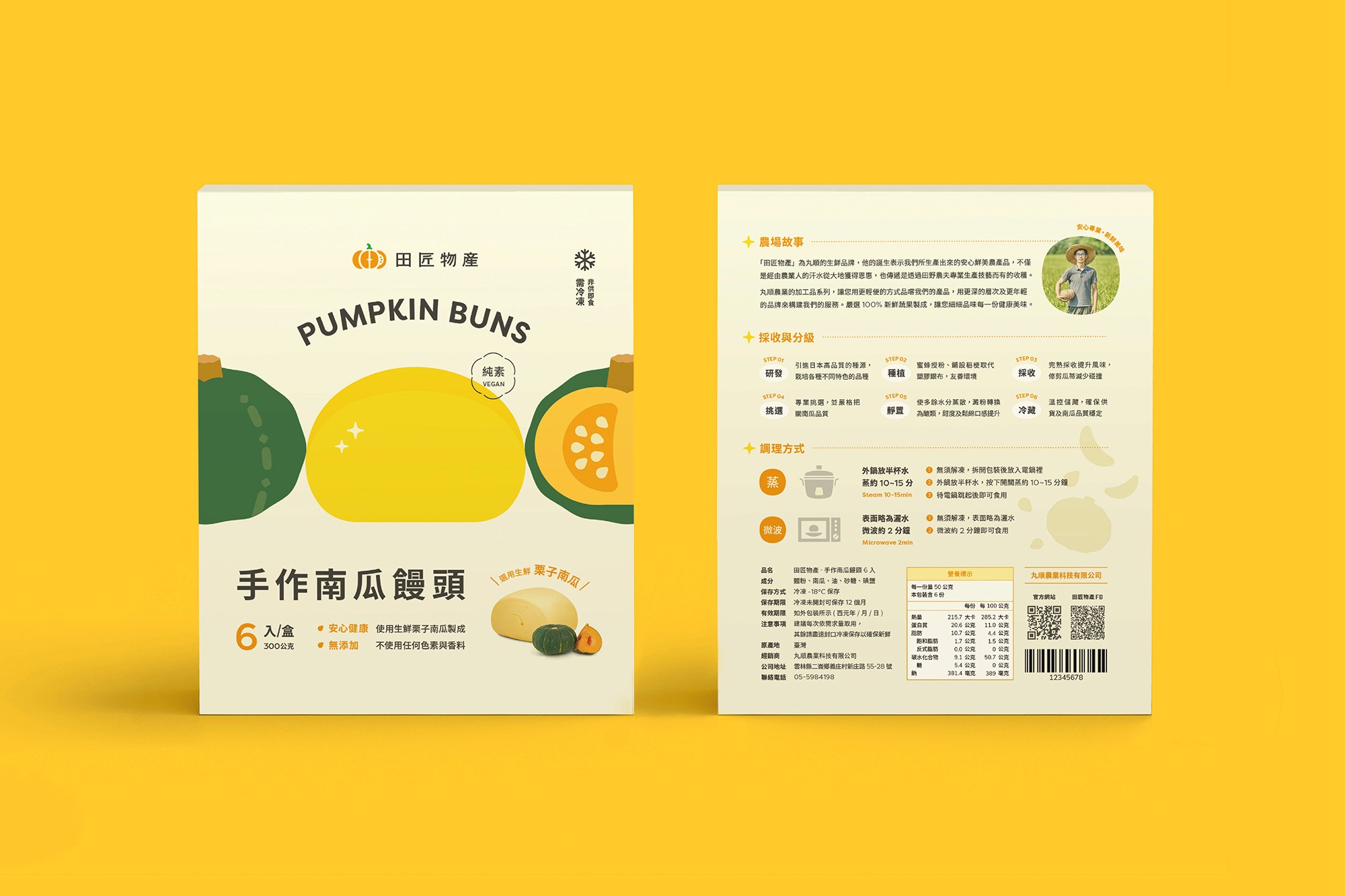
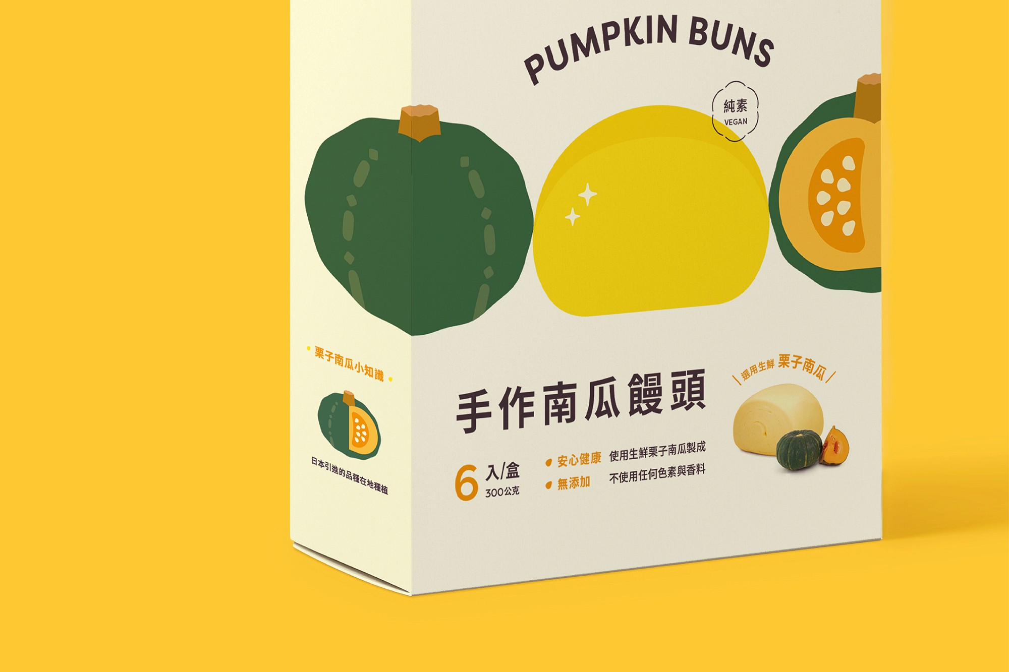
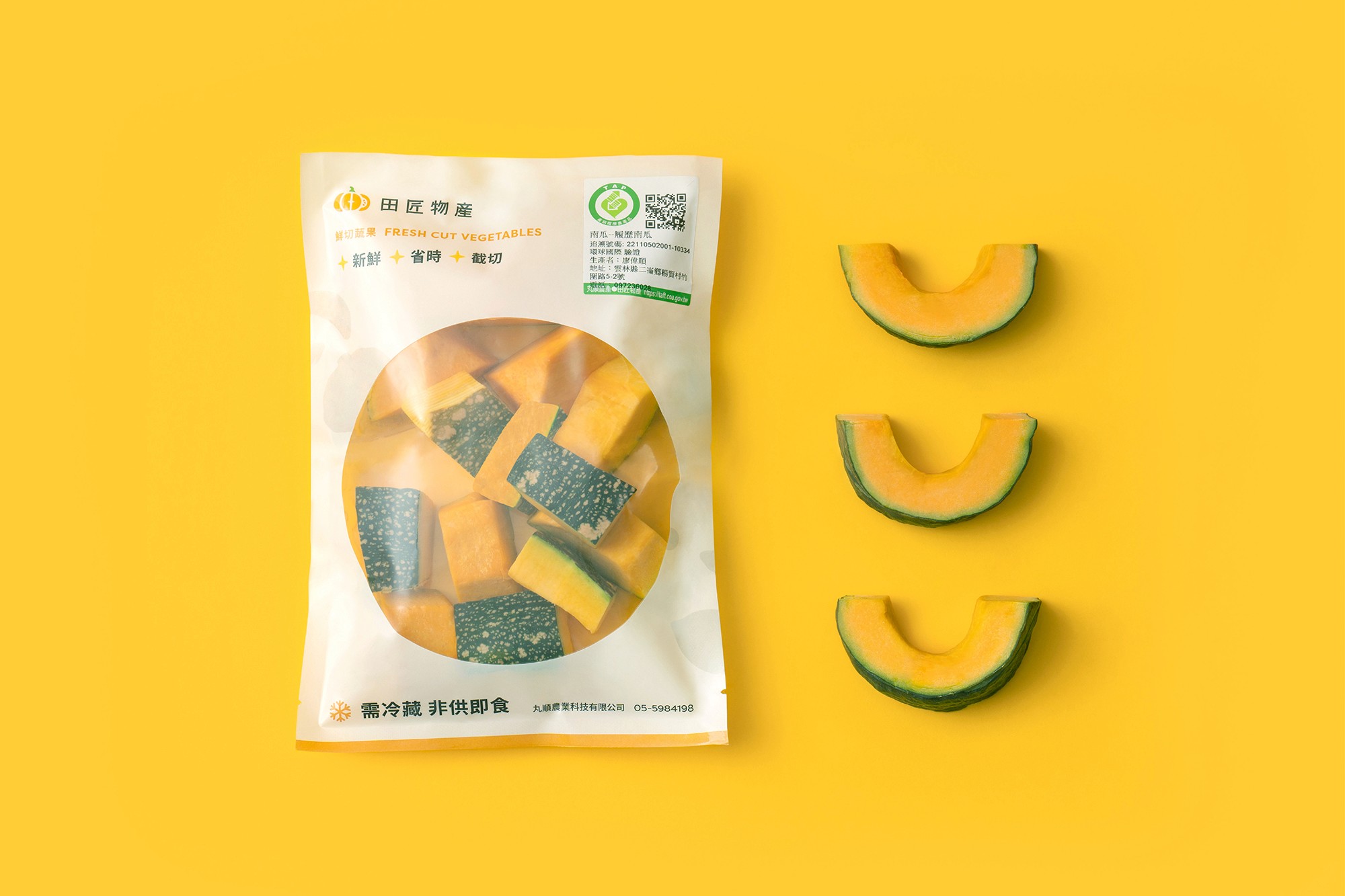
田匠物產 為丸順農業旗下的生鮮品牌,意指來自田野間的匠人。為了生產安心且鮮美的農產品,仰賴農人辛勤耕耘及大地賜予的恩惠,更需要專業種植技藝的傾注。田匠主力為各式品種南瓜如栗子南瓜,及系列南瓜加工品。從南瓜種源至生產包裝的參與式整合運銷模式,以友善栽培、生鮮採收到截切加工,步步都嚴格把關,讓優質的瓜甜美味,從雲林自然農場送達您的餐桌。
我們賦予田匠物產更年輕現代的品牌形象,並強調田匠物產不僅以南瓜作為核心專業,也以同樣的職人精神栽種其他各類蔬果。設計上運用大量圓弧線條和明亮溫暖的顏色,營造出親切友善的形象,拉近與親子族群的距離。
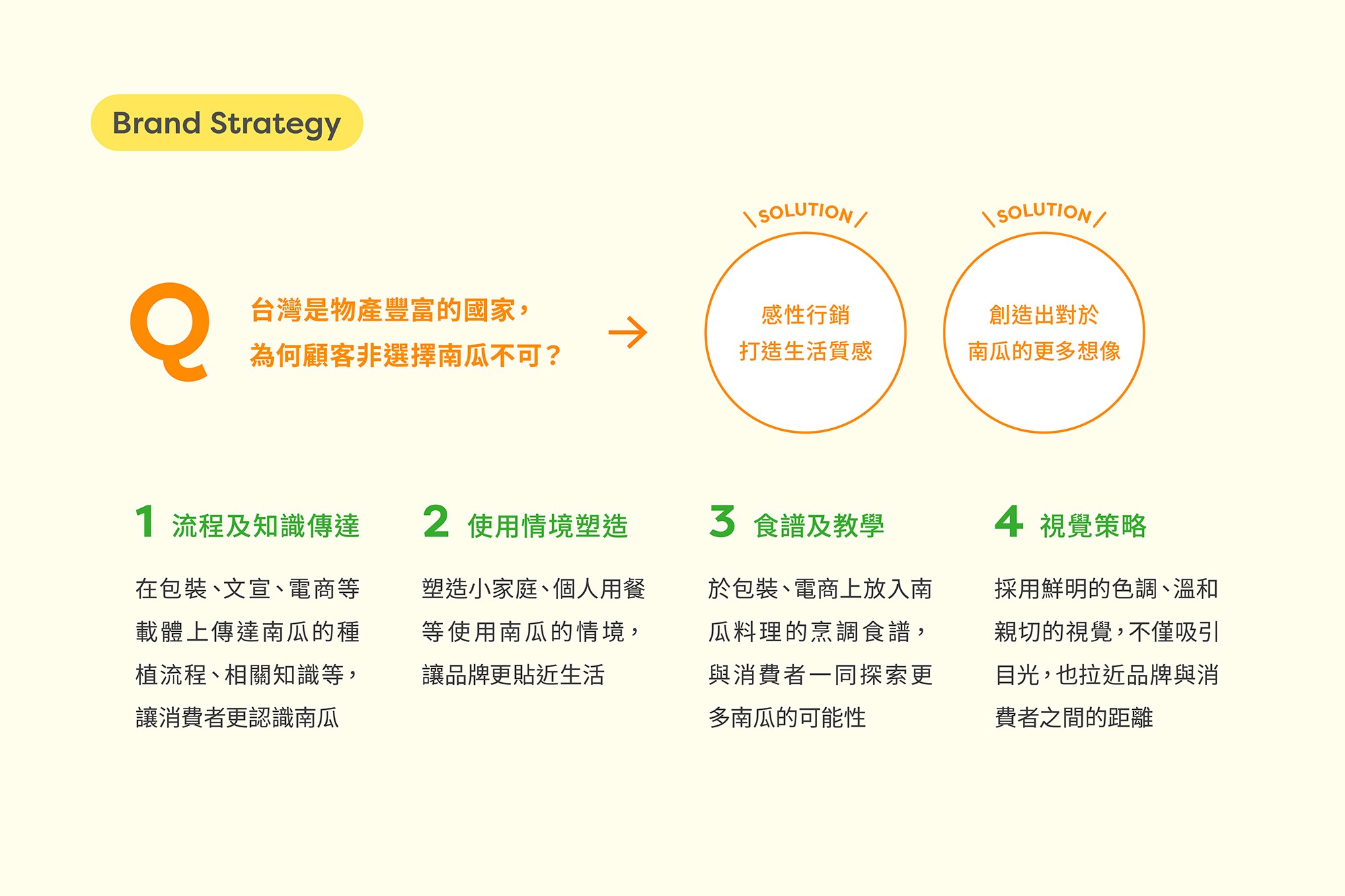
依照品牌策略,我們概括了三個設計策略方向,包含「簡化、傳遞本質、親切友善」。把標誌線條簡化,放棄原本複雜的組合形式,讓標誌在任何尺寸上使用都能清晰顯示細節。其次,為了傳遞田匠身為南瓜專家的本質,我們以南瓜作為主要的 Logo 構成,讓觀者能夠一目瞭然。同時標誌由蔬果切片和南瓜籽組成,讓觀者除了想到南瓜,也能聯想到田地裡其他優質作物。
這次的品牌重塑不僅增加客戶對品牌的印象,也在琳瑯滿目的貨架上與其他品牌做出區隔,進而建立田匠成為一個深植人心的品牌形象。
田匠物產 Tian Jiang Crops


CL
丸順農業 Wan Shun Agriculture
AGCY
台灣設計研究院 Taiwan Design Research Institute
CONS
中華民國農業部 Council of Agriculture (COA) Taiwan
CD
Billy Cheung
AD
Gloria Mak
D
Zora Huang
ILLSTR
-
PM
Abby Wang, Johnnyg Chuang, Doris Peng
ED
Yuning Chen
ID
-
P
-
PROD
-
PHOTOG
Final_Final Studio